Overview
A booking is a promise. Manage My Booking is where customers come to check we are keeping it.
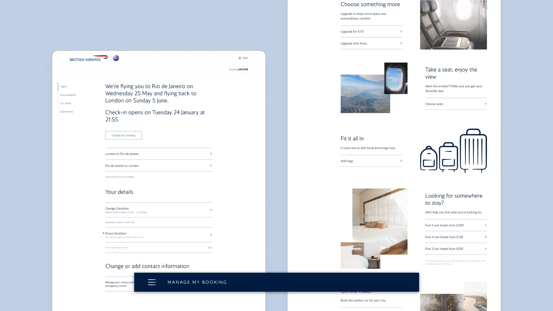
Nearly every BA journey after purchase passes through the Manage My Booking Hub: changing seats, adding bags, requesting meals, checking flight details. By 2023 the Hub was fighting the people using it. A previous redesign, built on a design language an external agency never finished rolling out, had optimised for air and imagery over findability. Core actions sat inside full-page marketing modules that customers read as adverts rather than servicing. The page stretched into a river of scroll, and revenue-driving third-party services had been folded into a menu that did not read as a menu. Customers said, in writing, that they preferred the older design.
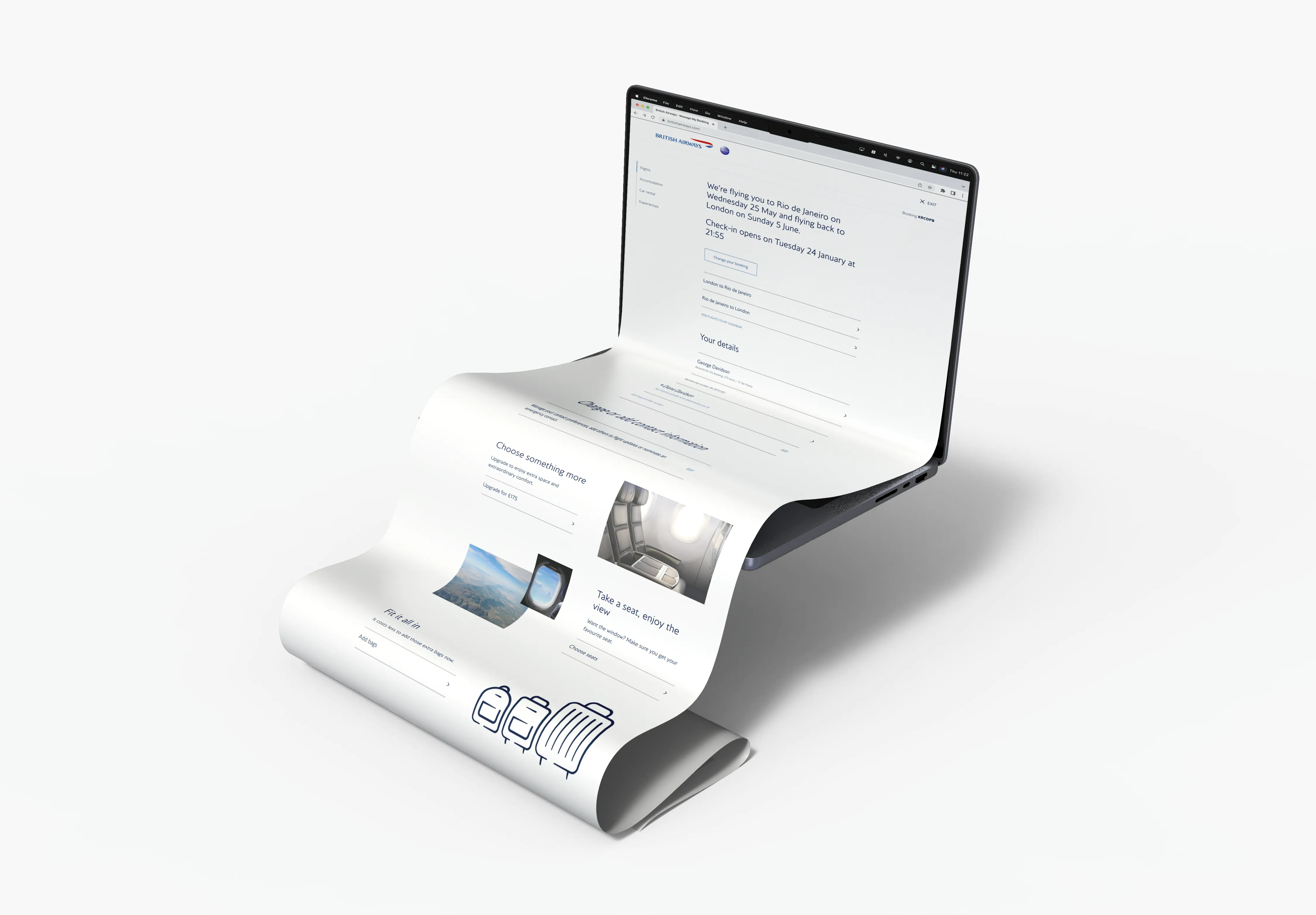
There was a second, less visible constraint. Classic BA.com rendered this page from an XML feed derived from the PNR in a decades-old global distribution system. Like banking, aviation runs on ancient rails. At the same time, BA had launched a £7bn transformation programme that would replatform the entire digital estate. The brief was therefore double-horizoned from the start: fix a revenue-critical surface on a platform with limited life left, in a way that would still matter once that platform was gone.
What I did
Mapping the whole estate myself would have cost months and made me the bottleneck, so I did the opposite.
Before redesigning anything, I had to find out what was actually there. The Hub had no single source of truth: its pages, journeys and flows had accreted across overlapping legacy versions, and each product team had only partial visibility of the estate behind its own area. I ran a short IA refresher with the product teams, gave them the basics of site and user flows and the artifacts that hold them, then set each team to map its own product. The output was the Hub’s first shared information architecture. The lasting output was teams who could see and own their own estates.
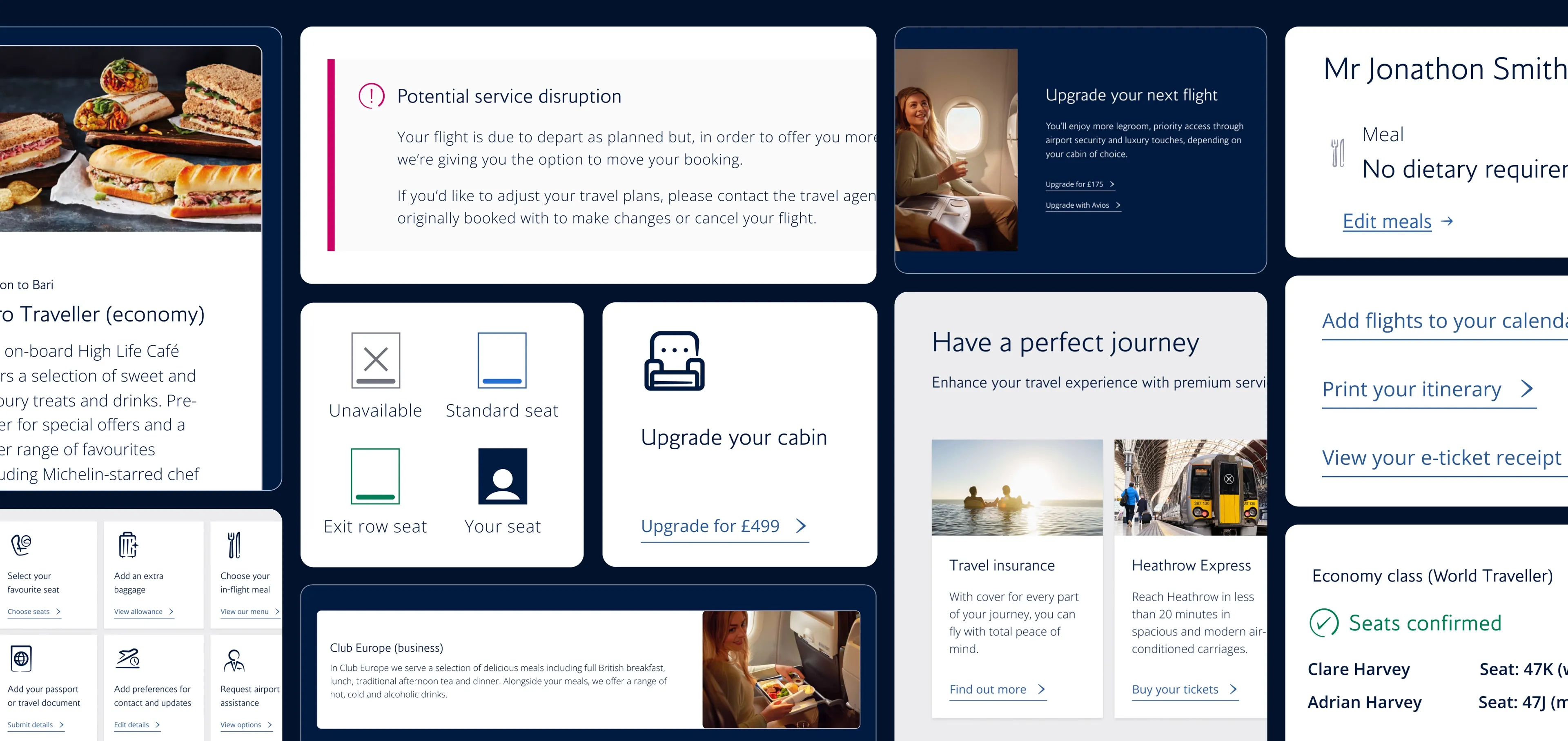
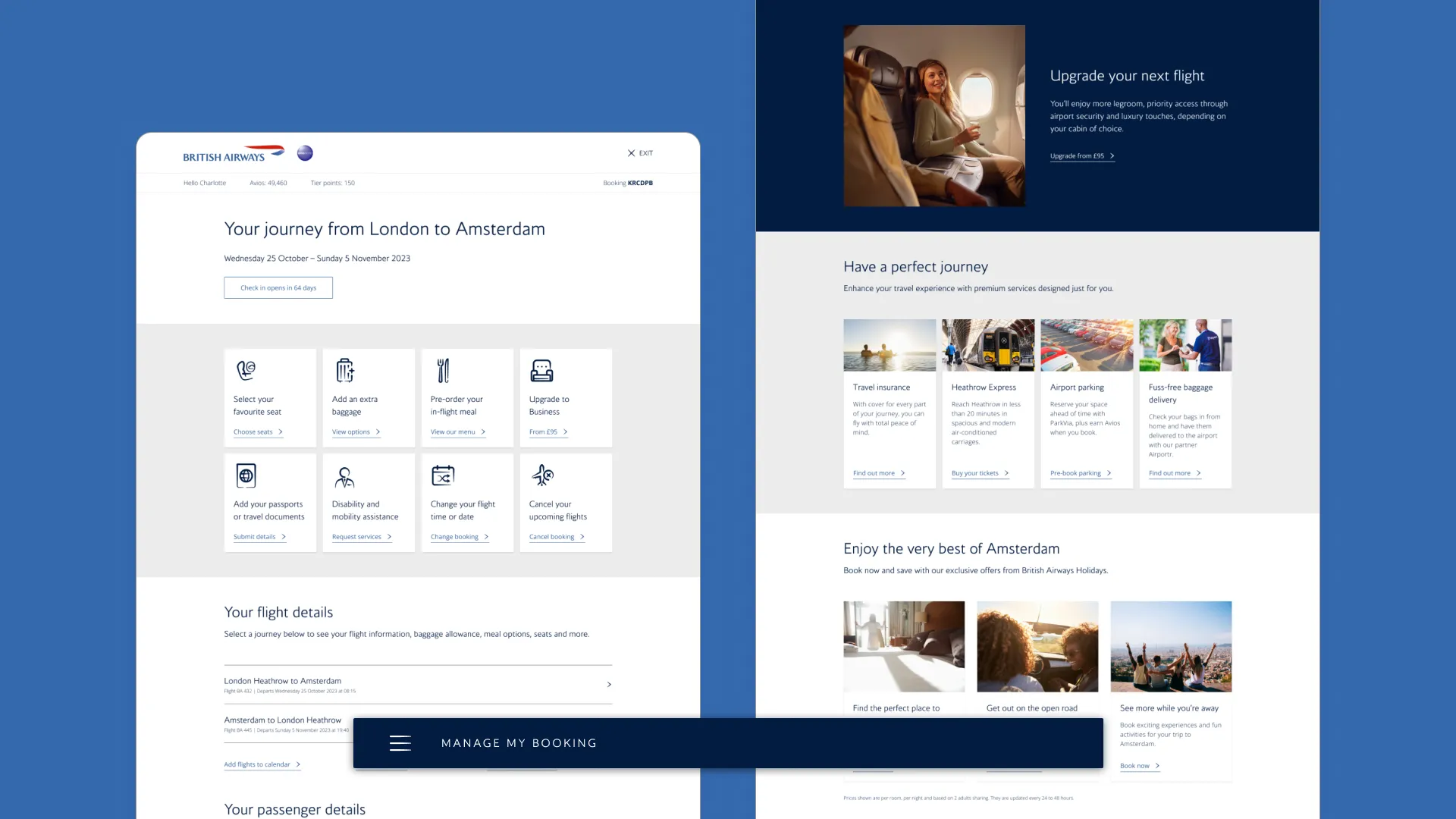
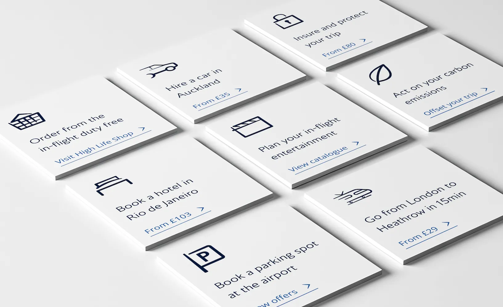
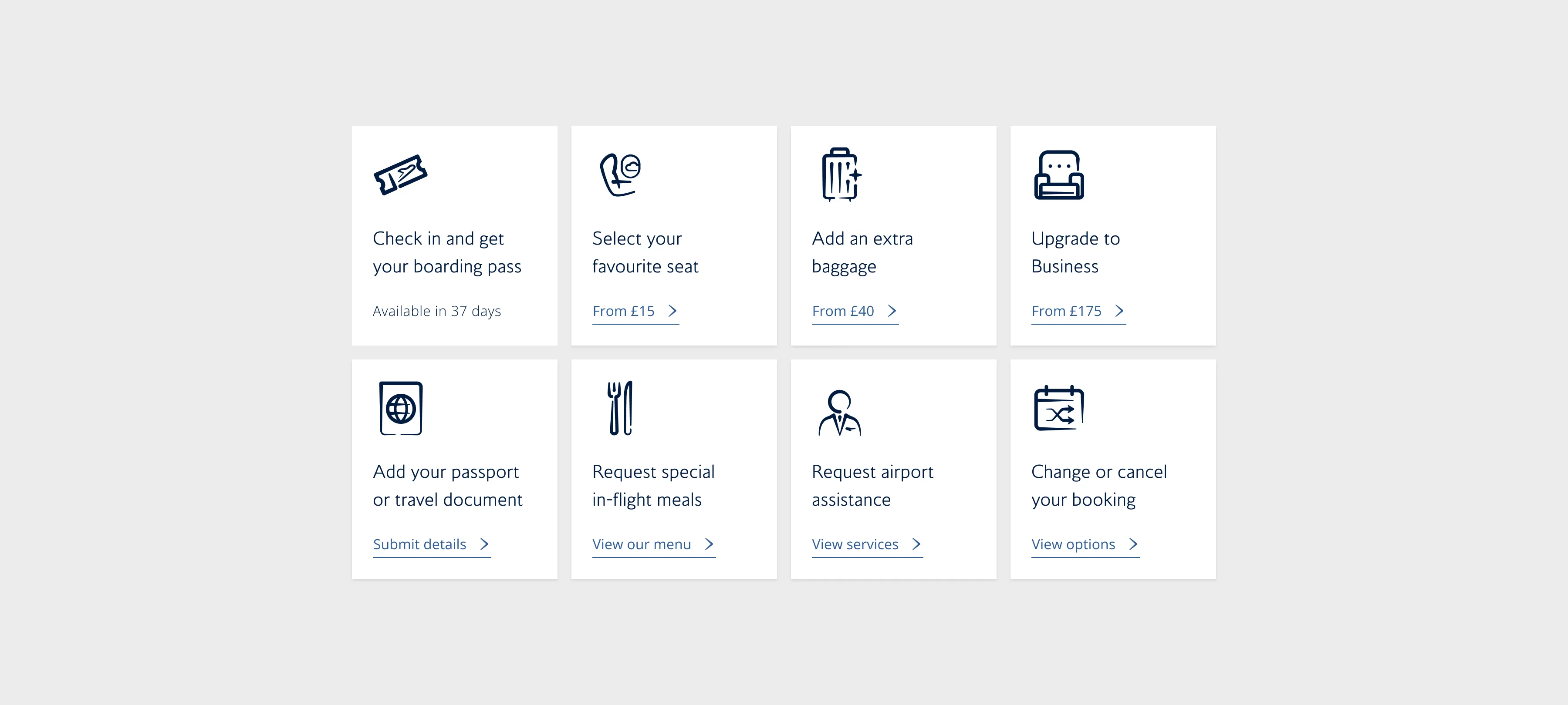
On that foundation I designed the tile grid: every core action expressed as a consistent, self-contained tile, grouped and sequenced so the jobs customers came to do, and the revenue-generating actions that had been buried beneath the marketing, now sat above the fold where they could be found. One way to scan everything a booking allowed, and one pattern for squads to ship into instead of inventing their own.
But the tile grid was one module in a larger system. I rethought the whole page as a set of interchangeable modules, each with its own job and its own rules: the flight-details module; a marketing module built from an image, a heading, a short intro and a call to action; a third-party ancillary module, pulled back out of the menu that had buried it, carrying an individual card for each partner product that could flex by destination, profile and propensity to buy; and a British Airways Holidays module with three cards for hotels, car hire and experiences. Every module could be reordered, and every module could evolve and personalise on its own. The page stopped being a fixed layout and became a system composed for each customer at the right moment.
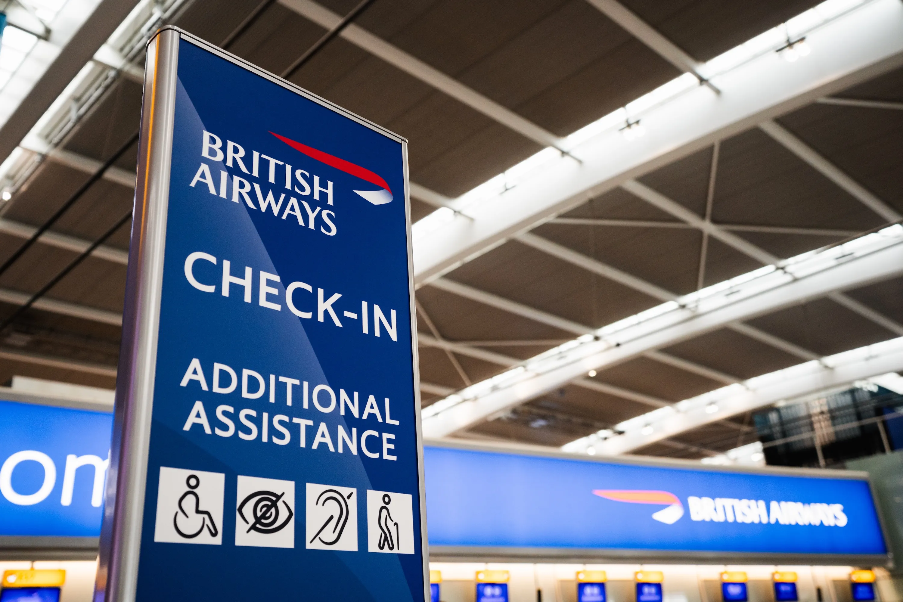
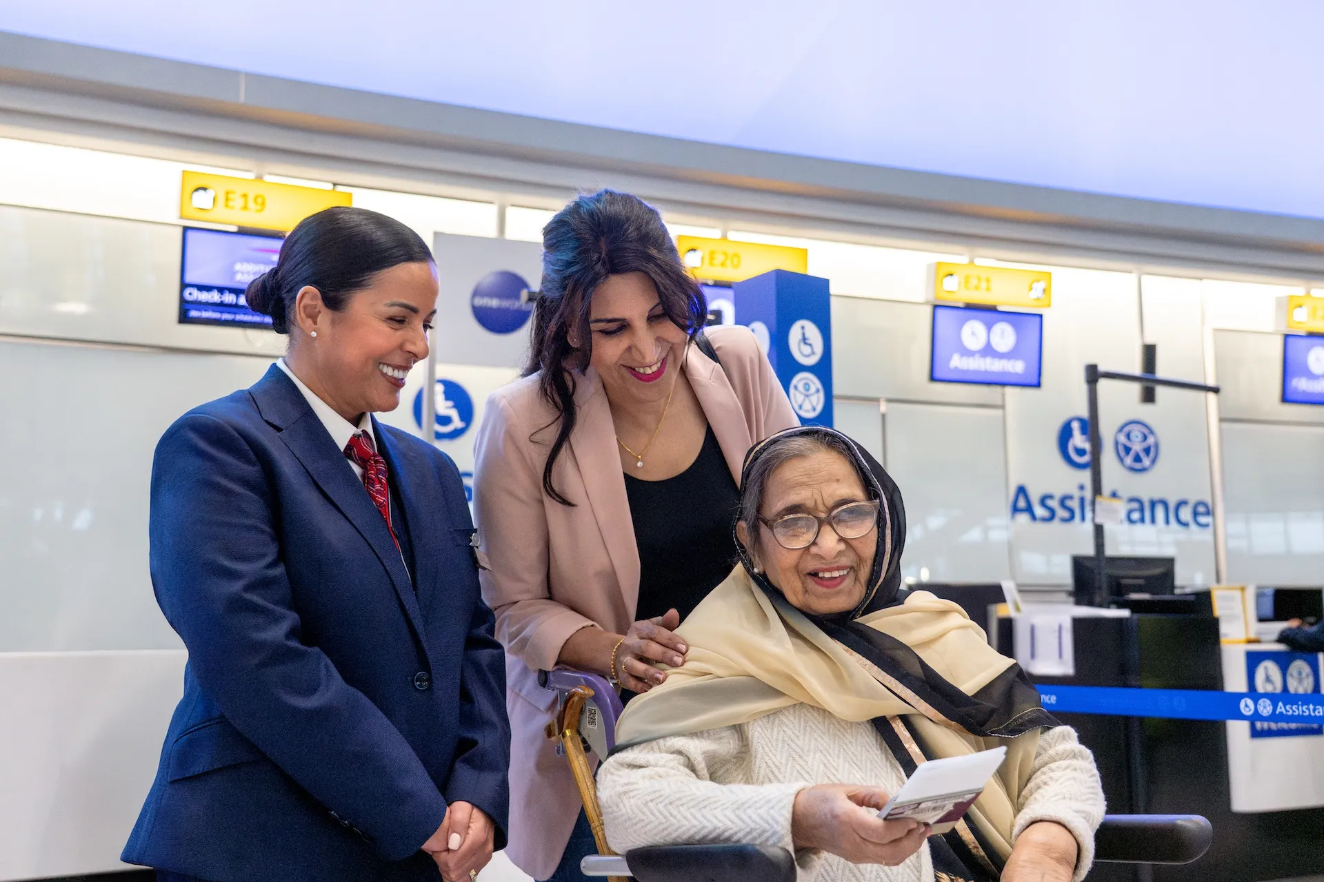
Accessibility sat inside the design work itself; there was no separate remediation pass. The Request Assistance flow earned its own tile, and engagement with its assistance modals rose +37.88%, part of why the structure tested so well across abilities and devices.
The decision: build the container before the data
The ambitious version of personalisation was clear. The backend could support almost none of it.
The grid was built to surface what mattered to a specific passenger: offers shaped by time to travel, by journey stage, by profile and propensity for upgrades or third-party products. The structure could support all of it.
A page rendered from PNR-derived XML offers no reliable foundation for profile-driven filtering, and integrating the legacy systems involved was not possible. With the replatforming already announced, the contested question became one of investment horizons: how much future do you build into a surface that will be switched off within a year or so?
The call I shaped and argued for was to build the modular container anyway and run coarse rules inside it. We shipped personalisation by destination and time to travel as a deliberate stand-in for the profile-driven version, and accepted that the full design would never run on classic BA.com. We cut the data-rich personalisation and kept the structure that made it possible. It is an industrial design habit I often end up coming back to: defining the structural grammar first, then letting the modules speak through it. I had built the same instinct designing rails and tiles in streaming, where the catalogue never stops growing and the system has to hold whatever arrives.
That made classic MMB the proving ground. The grid generated the evidence and the rationale for building the same model on the new estate, properly powered this time.
Outcome
I set the redesign up so the call was never mine to win on opinion.
The old marketing pods were the control, the tile grid the variation, and live experiments were the arbiter. That is also how you prove a container before it is full: you test the entry-point pattern itself, not the offers behind it.
The pattern won, decisively and at high statistical significance:
- Engagement with seat options up +376%, and baggage engagement up +107%.
- Meals conversion up +34.6%.
- The upgrade entry point up +170%, carrying +18.7% more customers into the upgrade summary and +8.3% through to confirmation.
- A single clearer login CTA lifted progression into the Hub by +1.8%.
I reported the misses too, because that is how you know the wins are real. Baggage engagement more than doubled, yet baggage conversion did not move, so I flagged the flow as the next thing to investigate rather than dress it up as a result. The discipline cut against my own ideas: I once trialled stripping a piece of eligibility messaging to simplify the page, and the data showed it would push more customers into costly support contacts, so I left it in. I treated all of this as leading indicators of revenue, never as clean attribution.
One trade-off I expected and owned: surfacing the core jobs above the fold pushed the flight-details section down the page, and engagement with it fell by around 41%. The experiment caught it immediately. We scored flight-details findability as the highest-priority fix on the backlog and shipped the next round against it: a clear header and summary, the print-itinerary link moved somewhere people could actually find it, the page shortened. Findability recovered, without surrendering the ancillary gains.
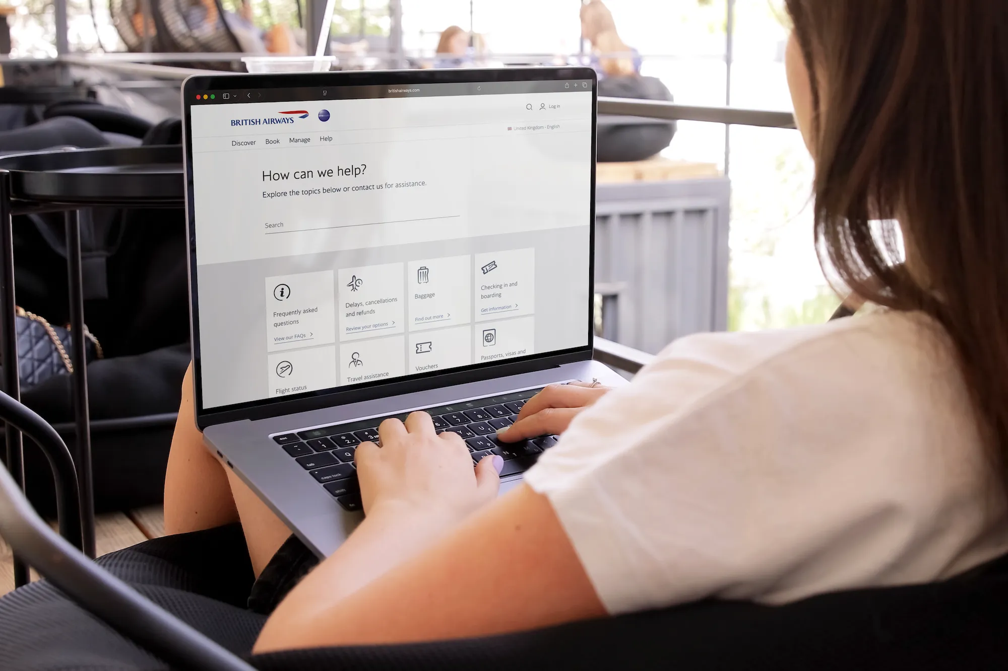
The clearest proof that this was a system came when other teams took it. The Help Centre rebuilt its own service navigation on the same tile grid, findability rose, and engagement with contact numbers fell 15.3% on mobile, a leading indicator of people solving their own problems instead of calling.
The structure outlived the platform it shipped on. Manage My Booking in the new BA.com is built on the same modular model, now powered by a modern backend and NDC distribution capabilities that enable the mix-and-matching of BA and partner ancillaries the original design anticipated.
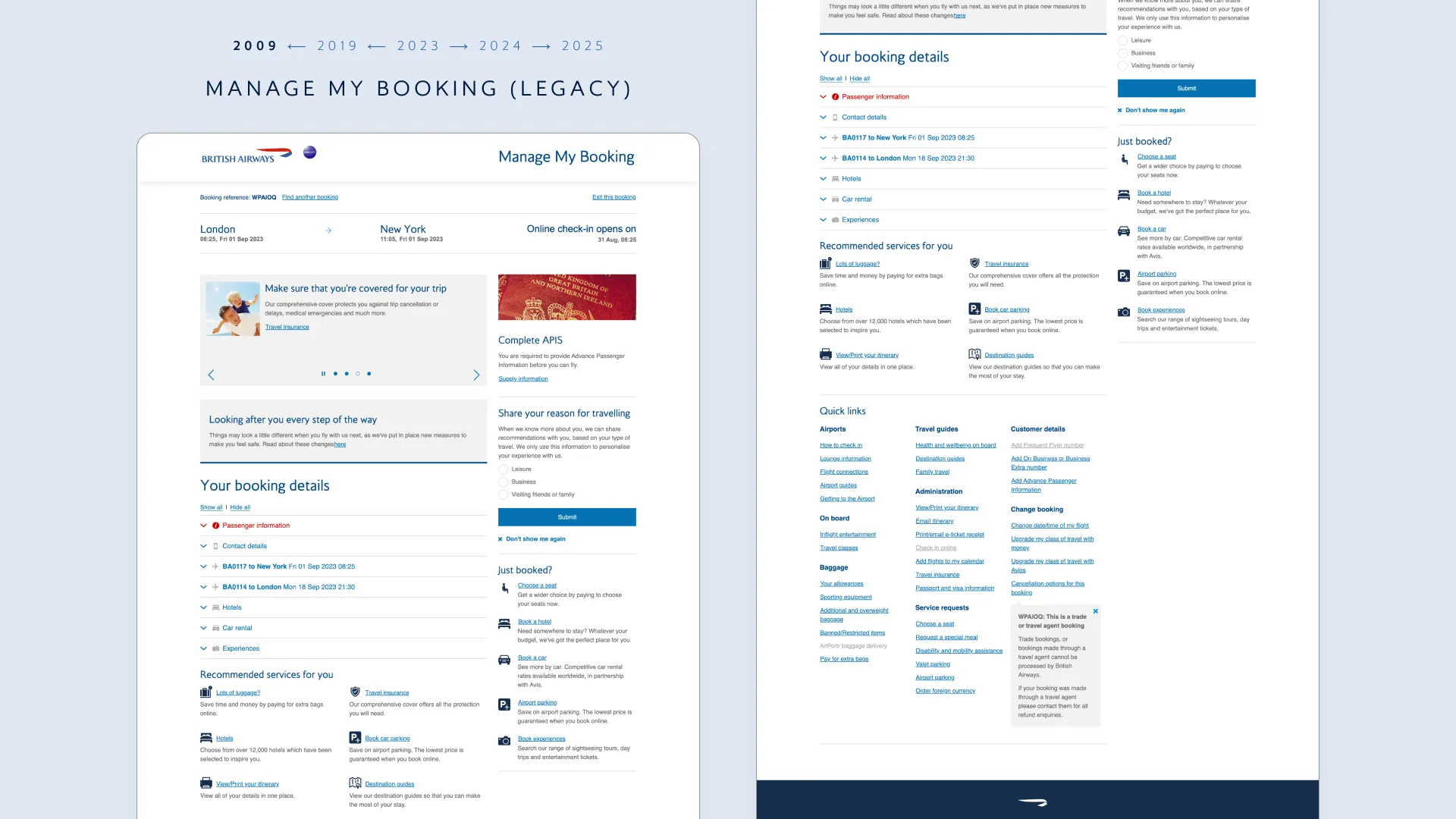
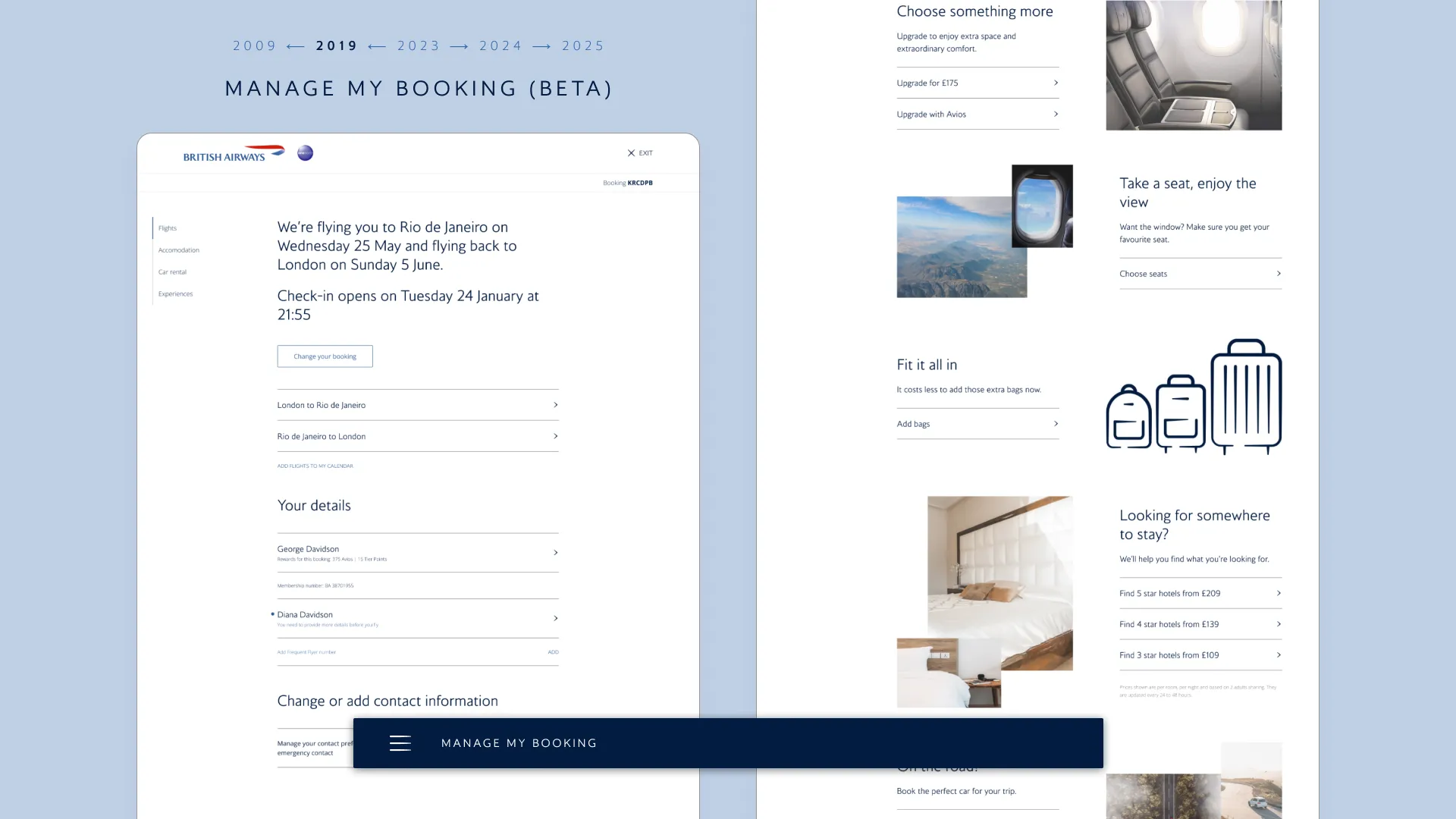
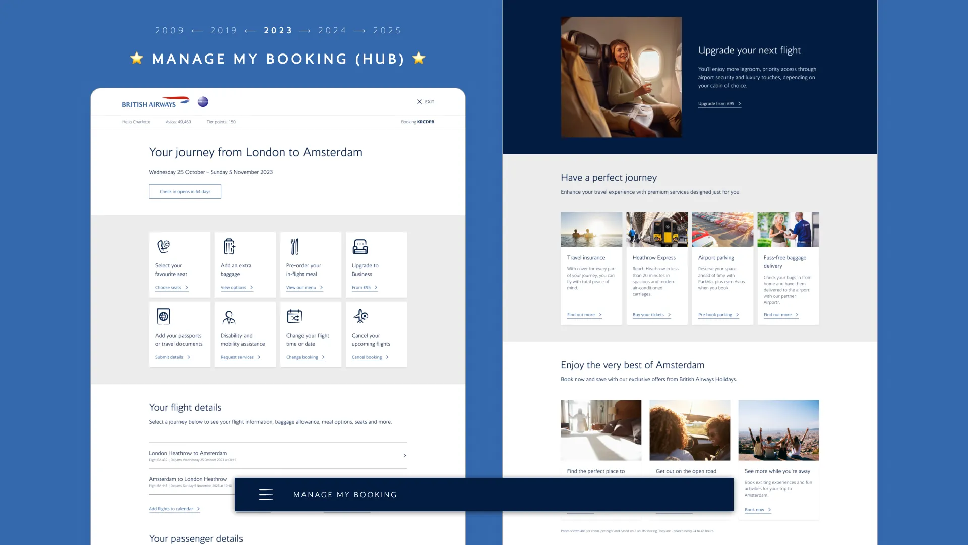
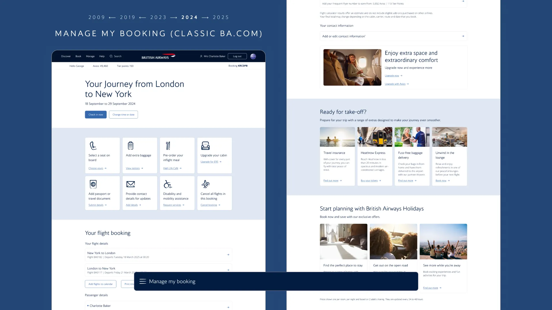
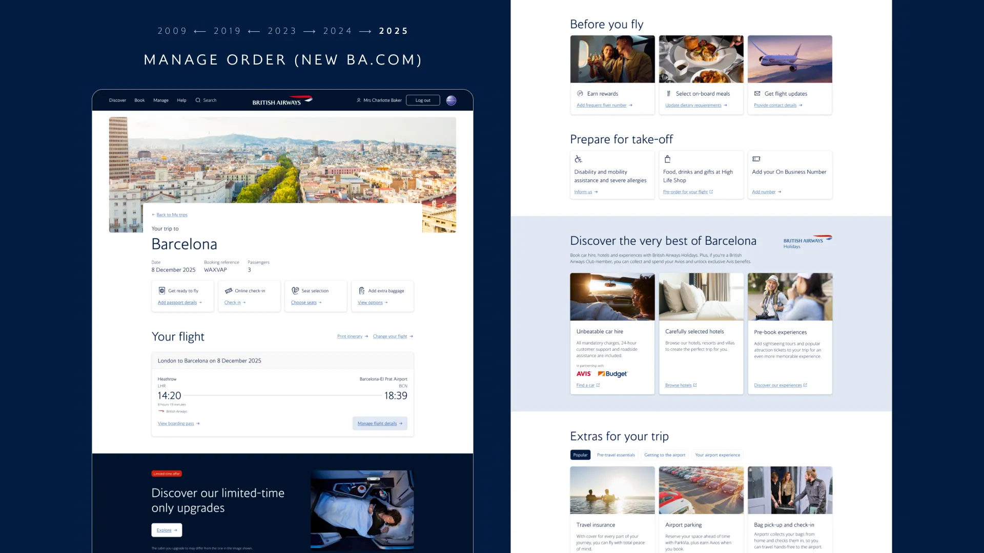
2009
Legacy version of Manage My Booking, developed in-house in the 2000s
2019
Beta version of Manage My Booking, a showcase implementation of the previous World of Flight design system
2023
Manage My Booking Hub structured with the modular system I designed, based in the current BAgel design system
2024
Evolution of the modular structure in the sunset version of Manage My Booking, before migration to New BA.com
2025
Card-based modular structure living on the new Manage Order product, rolled out as part of New BA.com
What I took from it
Platform lifespan is a design constraint, and treating it as one is a leadership judgment rather than a compromise.
Good enough for a dying platform and foundational for the next one can be the same design, if the structure is right. I learned to argue for that distinction explicitly: ship the value the current rails can carry, and let the work itself become the business case for what comes after.
The most durable things I left behind were a pattern other teams adopted as their own, and product teams who could map and own their estates without me.