Overview
Every airline app now competes with the best apps on its customers’ phones.
For years, BA’s mobile app was understood as a distribution channel: a place for flight information, check-in and a degree of booking servicing, largely a shell of whatever ba.com could offer. Aviation is not alone in this. When digital products grow up inside commercial structures, they tend to inherit a channel’s sense of purpose. The £7bn transformation programme set out to replatform the entire digital estate, and the initial mobile brief reflected that starting point: build a new app with feature parity to the classic one.
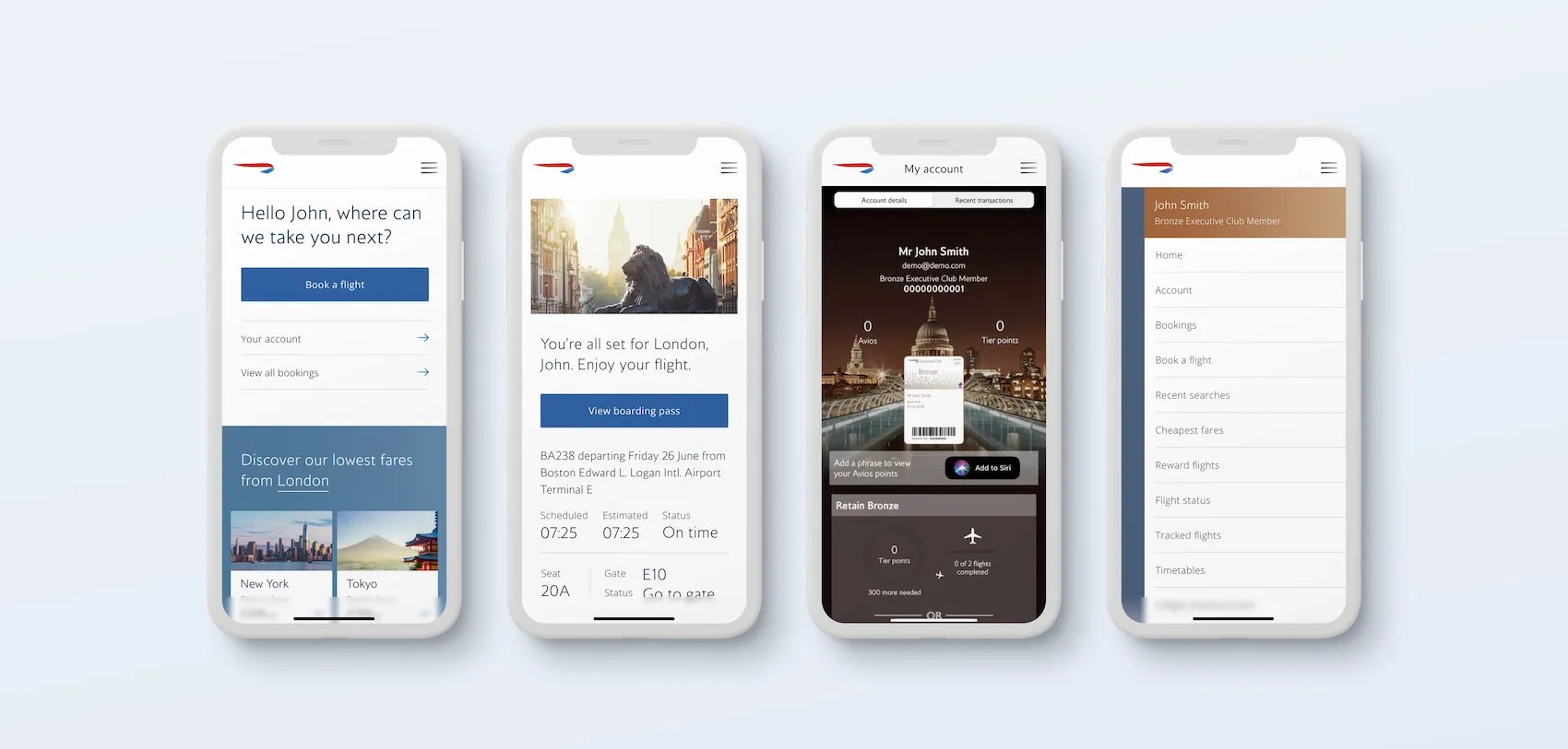
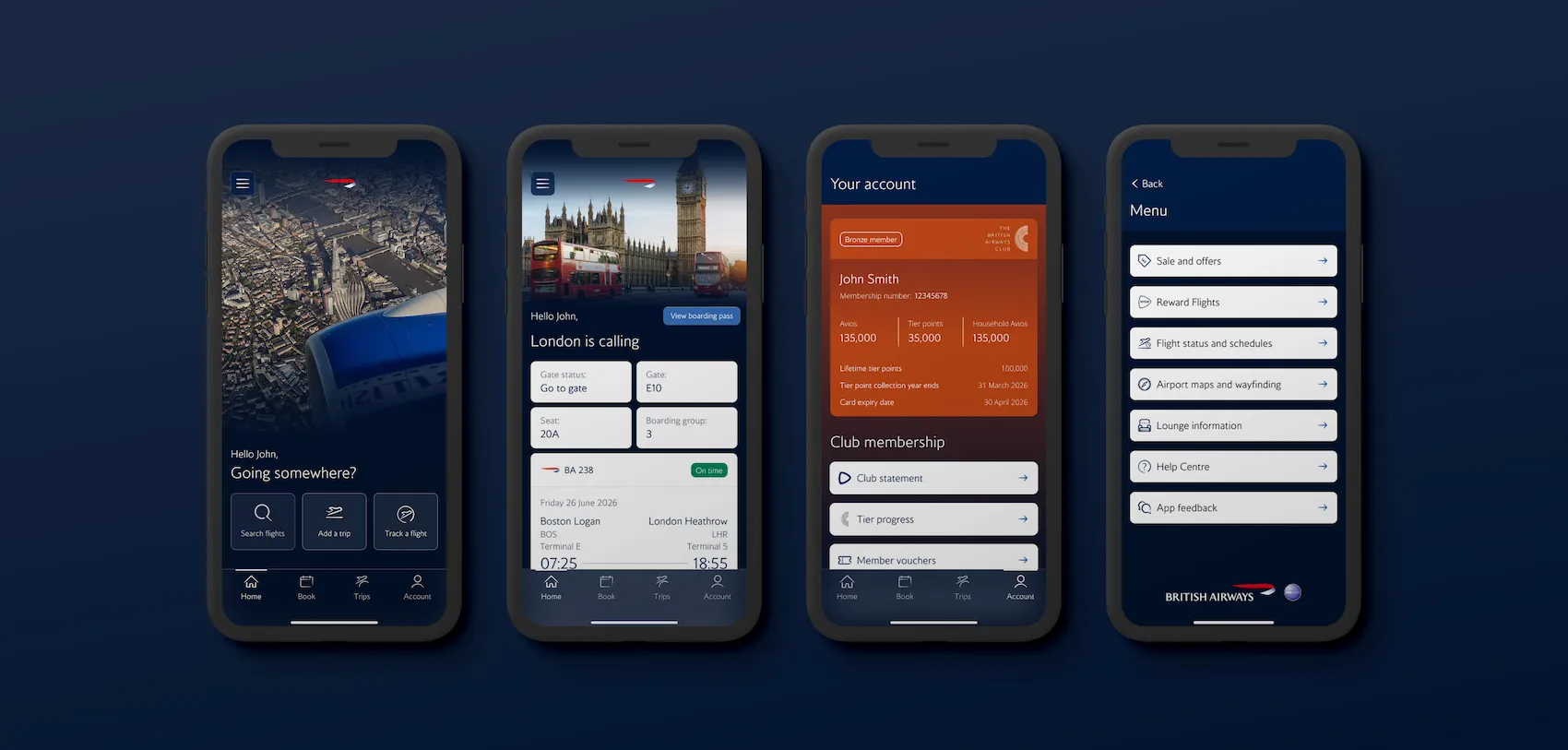
That parity baseline was the real design challenge. Matching the old app would modernise the rails without changing what the product believed it was for.
A framework to design against
A vision teams can’t build against is just a slogan.
I built a Customer Needs Framework for the mobile product: a hierarchy of five needs, from functional to emotional, adapted from established models of user experience. Information and Clarity, Convenience and Control, Assistance and Support, Personalisation and Intimacy, and Connection and Delight. Each layer names a real customer need, the known gaps in our current experience against it, and the opportunities open to us.
Its real job was shared language. Stated this way, the business could plan in terms of customer needs rather than channel features.
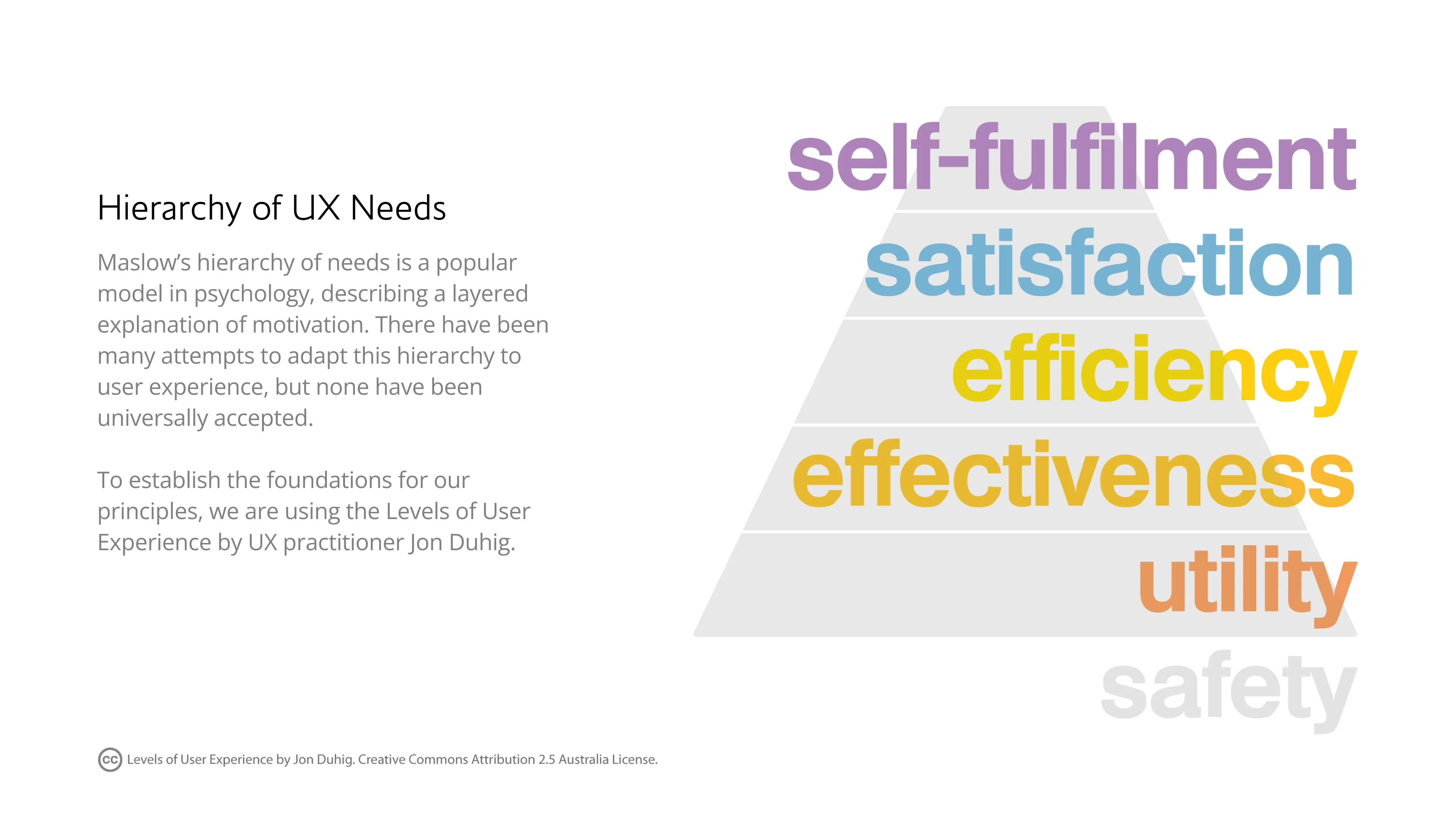
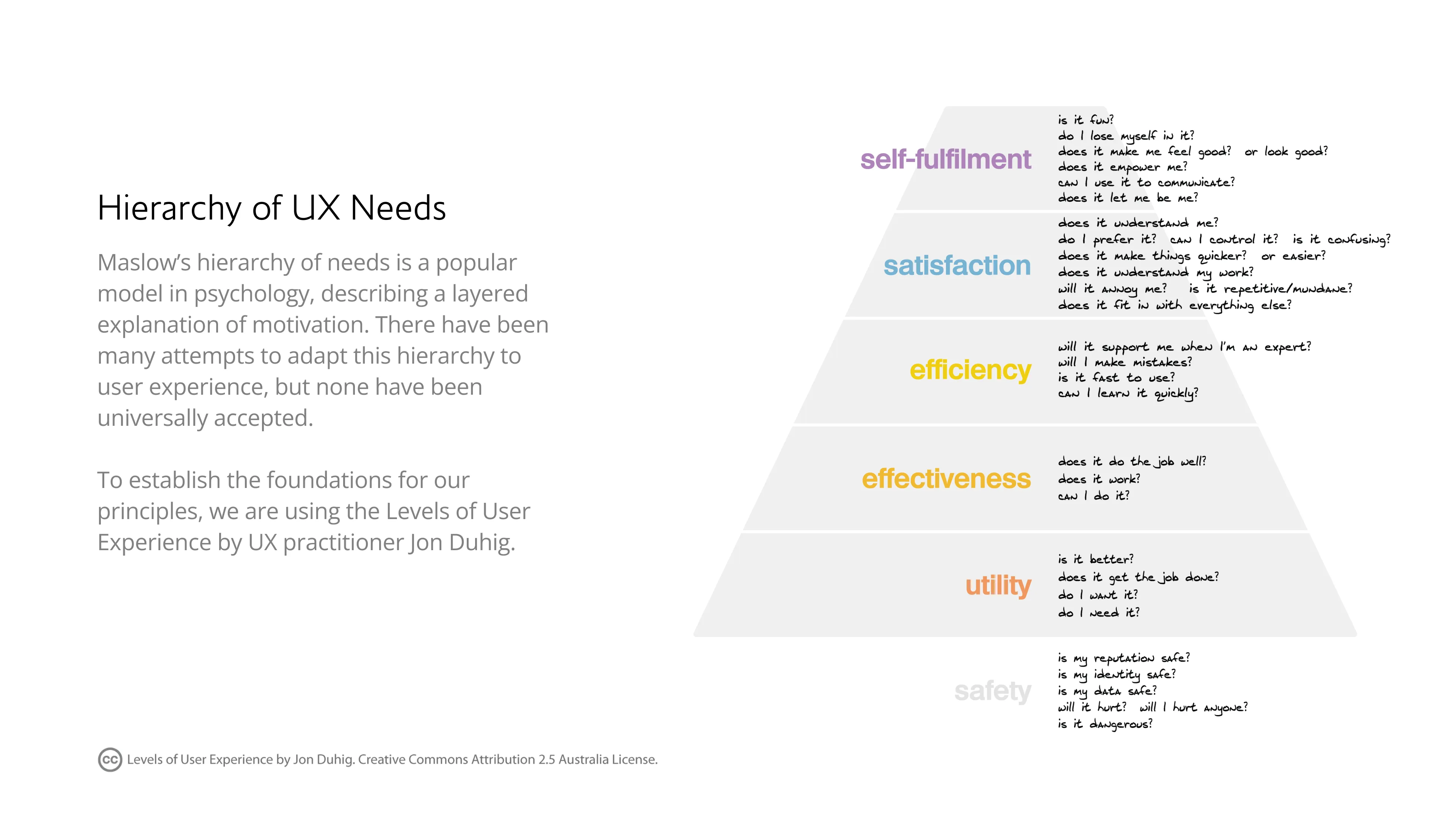
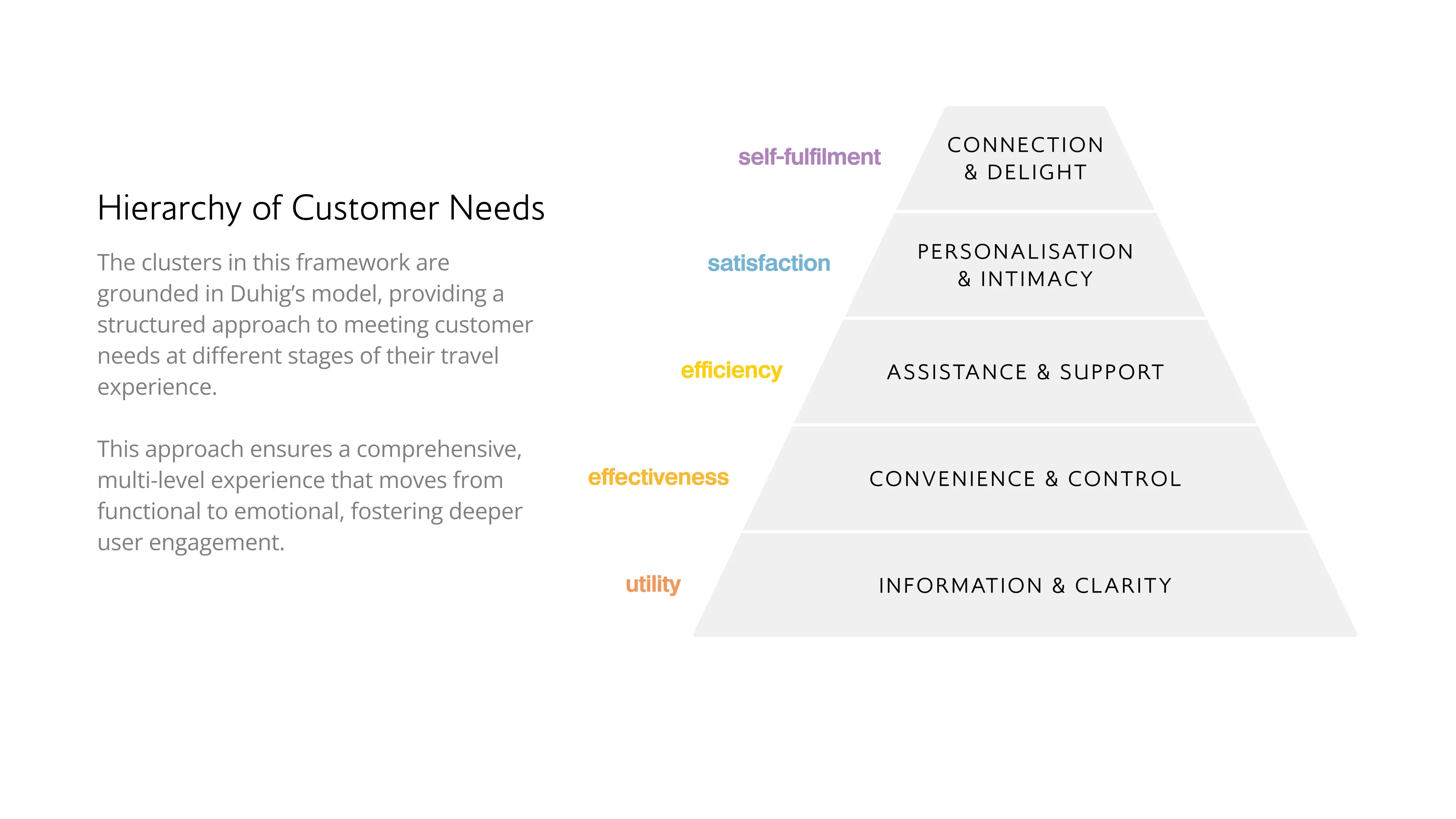
Derivative of "Levels of User Experience" by Jon Duhig, used under CC BY 2.5 AU.
Derivative of "Levels of User Experience" by Jon Duhig, used under CC BY 2.5 AU.
Derivative of "Levels of User Experience" by Jon Duhig, used under CC BY 2.5 AU.
I pressure-tested the framework against best-in-class digital products, inside and outside aviation: the clarity of one carrier’s real-time journey tracking, another’s self-service disruption handling, a hotel group’s portable personalisation, a consumer flight tracker’s sense of delight. Reaching beyond aviation was deliberate: a companion product is held to the standard of the best apps on the phone.
The framework then anchored a structured ideation programme with the team, using Kano analysis to sort blue-sky ideas into what customers treat as basic, what drives satisfaction and what creates delight, so prioritisation rested on customer logic rather than the loudest voice. This body of work established the mandate the mobile product is now designed against.
The Travel Companion model
Treated as a channel, a phone distributes services. Treated as a product, it travels with the customer.
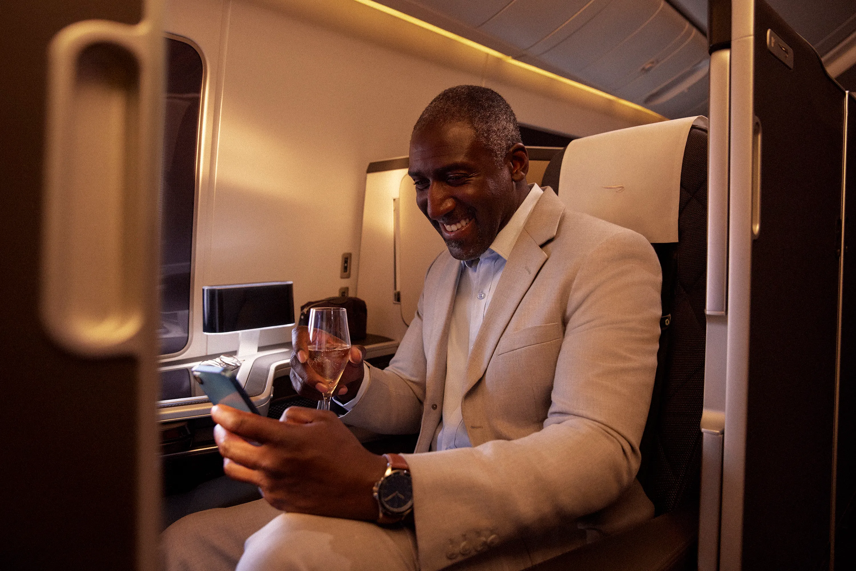
The shift I have argued for, and now lead the design of, is from channel to product. A phone in a traveller’s pocket is a privileged position: present at booking, at packing, at the airport, in the air and at arrival. As a product it accompanies the journey, guiding and supporting customers and letting them personalise their experience across every touchpoint of travelling with us.
That reframing implies a different purpose for the product, and a different way of organising the experience around the customer’s journey instead of the services we distribute. It is also, deliberately, a model the modernised backend can actually power. The framing now fronts the product’s own public launch language, where the app introduces itself as a travel companion.
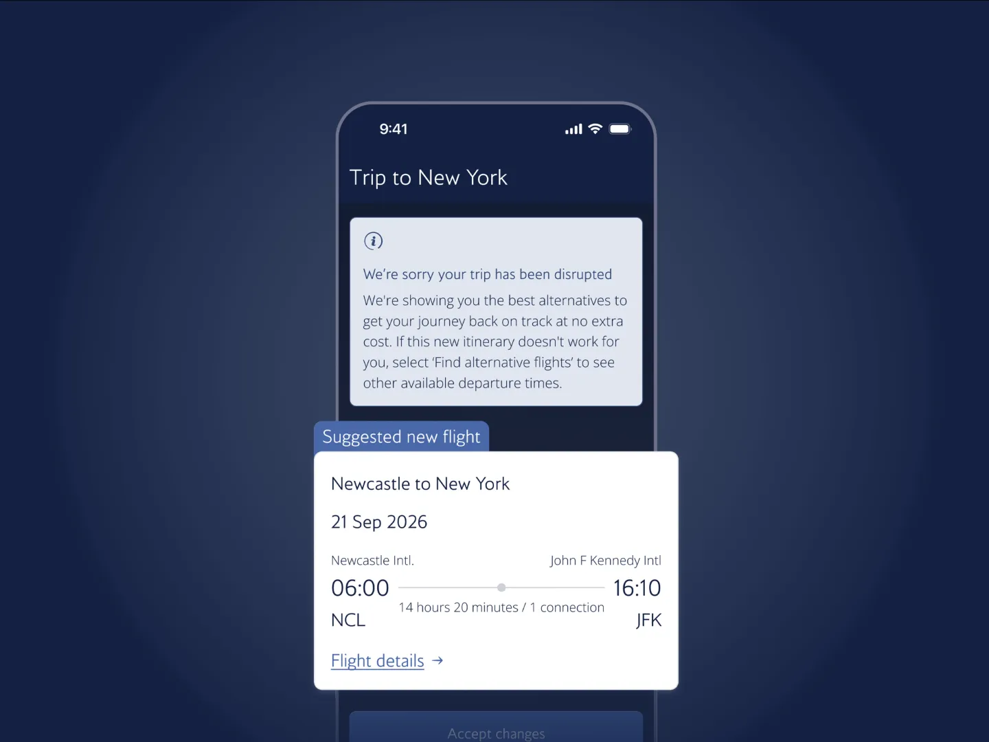
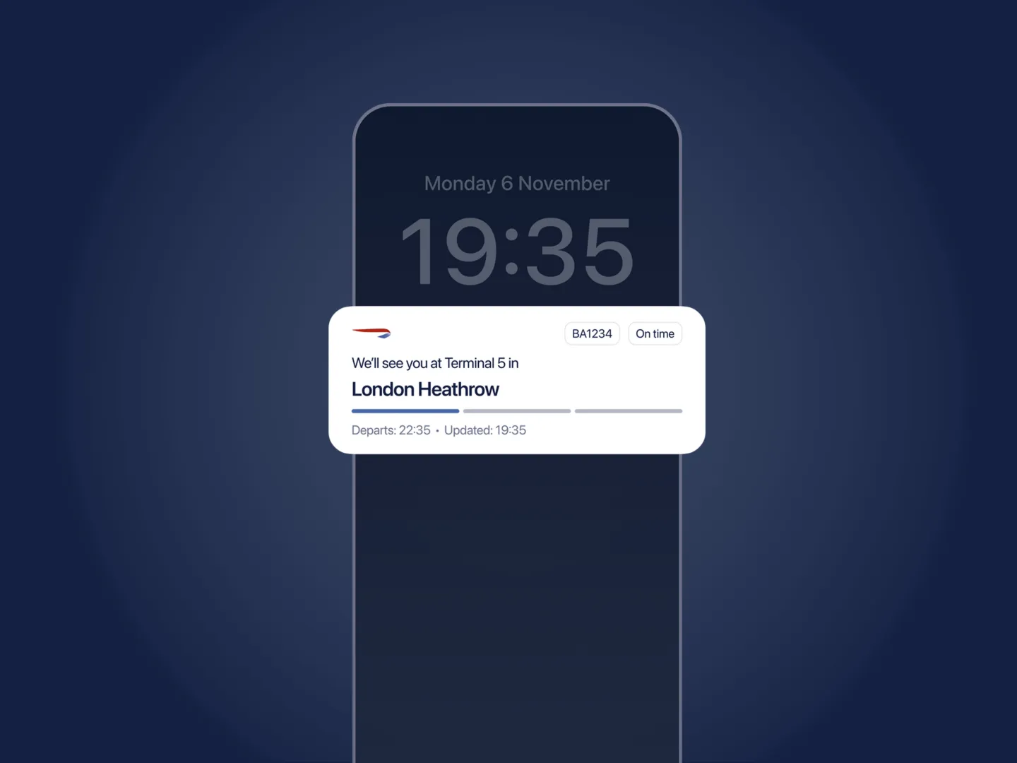
Disruption becomes a companion problem rather than a contact-centre one. When a flight changes, the app now puts rebooking and refund options in one place, support that reaches the customer before they have to chase it.

Making the case by building it
You don’t win a reframe in a deck, you build it.
The channel model is held in place by structure and habit, not by anyone’s bad intent, and arguments alone tend to bounce off it. So I treated the reframe as something to demonstrate: build the smallest convincing version of the companion product, with the right team and tooling, and let the result carry the argument. Everything below was built to serve as that evidence.
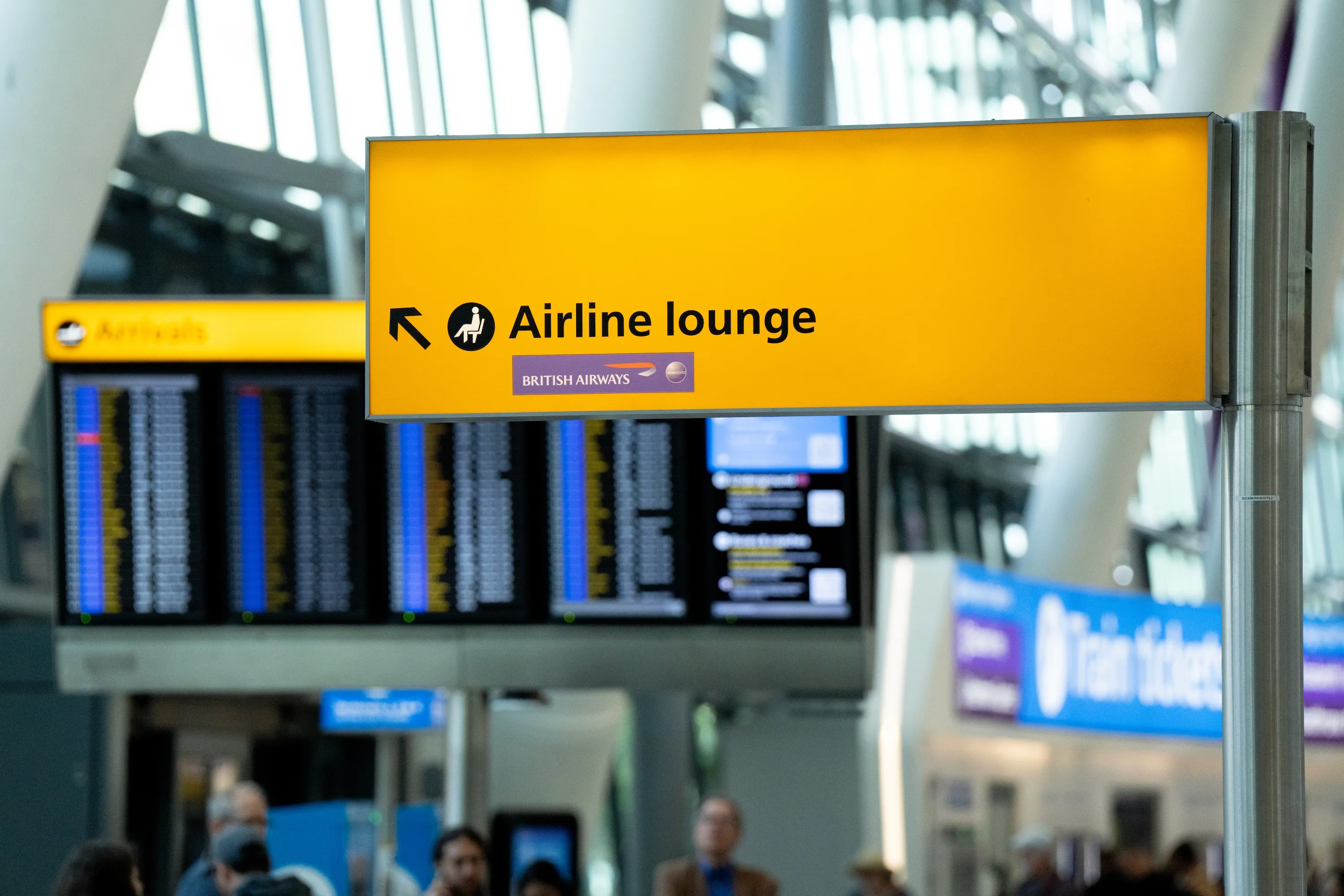
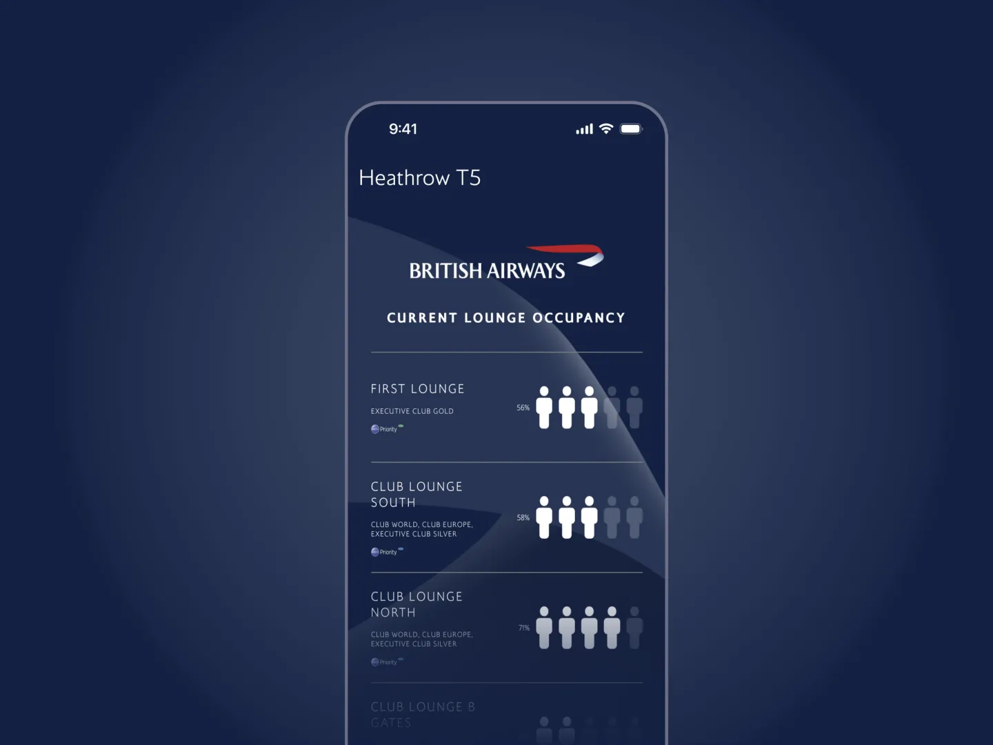
Live lounge occupancy at Heathrow Terminal 5 is one of those pieces: a small, genuinely useful companion feature that helps a traveller find a quieter place to wait before boarding, and one that has shipped.
My role
Leading the team who owns the vision and the system; directing the partners who build to it.
I lead the in-house design and research team for the mobile product and direct a client-side delivery-partner design organisation, reporting two levels below the Chief Commercial Officer. In practice that means owning the Travel Companion vision, steering component evolution with the design system, and feeding squad delivery roadmaps as the new app moves from first release toward the fuller model.
Designing the first impression
Nothing exposes channel thinking like the empty state.
It shows up most clearly on the home screen a customer sees when they hold no active booking: someone opening an airline app precisely because they are dreaming about going somewhere.
So we designed it as a discovery surface. The work was research-led in a literal, hands-on way. In co-creative sessions, a researcher guided participants through their ideal airline home screen while I sketched live alongside them, drawing each idea in real time and iterating together until the sketch matched their mental model. Those participant-authored designs were distilled into concepts, tested with a wider unmoderated panel, and the results shaped what shipped in the June 2026 release.
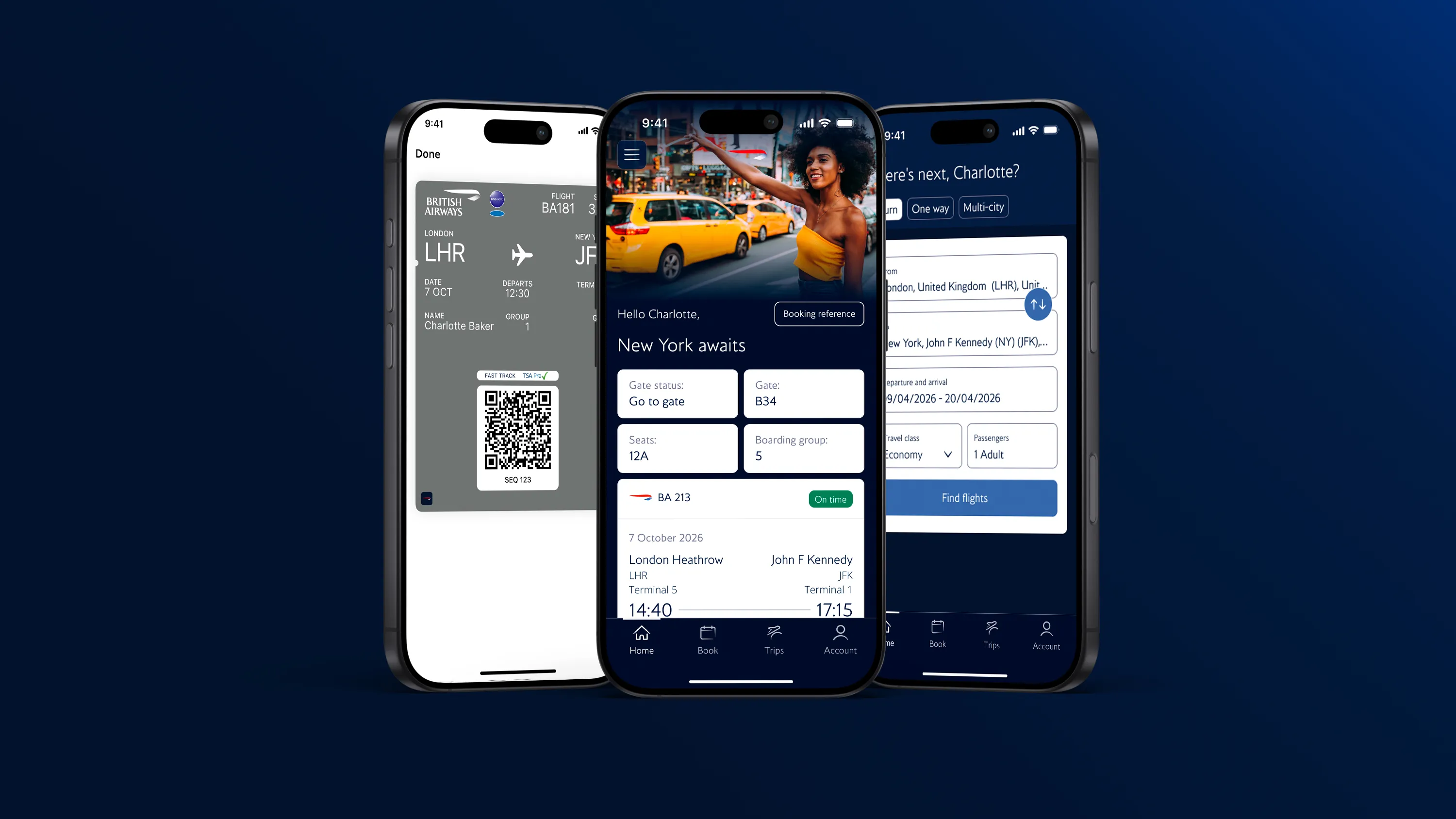
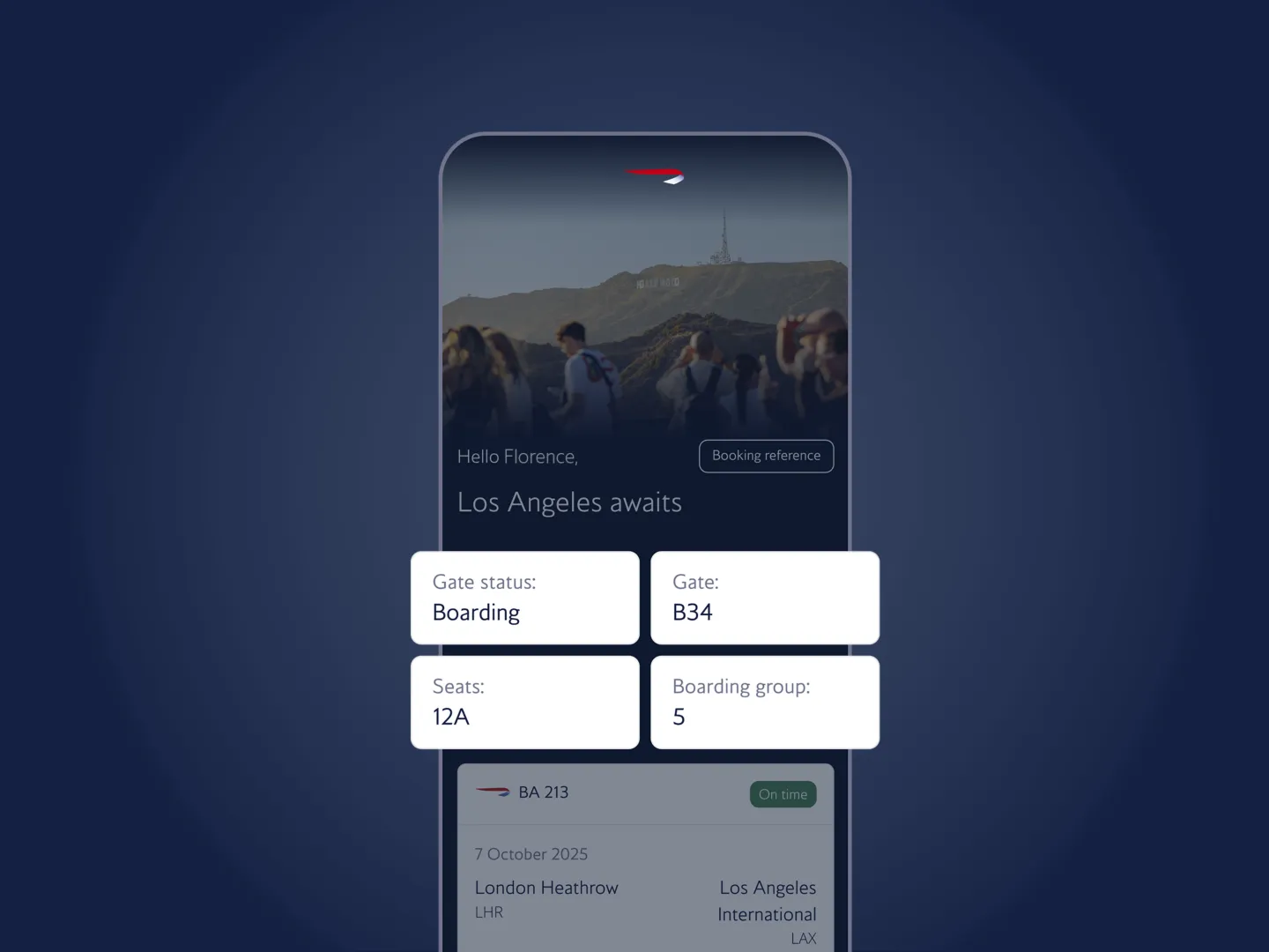
The shipped home screen is personalised to the moment. On a travel day it leads with the boarding pass and live gate details; with nothing booked, it becomes the discovery surface those sessions designed.
The speed had a cause worth naming. Because the team owned the whole loop, I could take the tested direction to a working, functional prototype over two evenings, using AI-assisted tooling and our existing design system, real enough to put back in front of customers. That is idea to tested prototype in a fraction of the time the previous, partner-dependent model required, and it is the clearest evidence I have for what a senior in-house team with the right tooling can do. The strongest proposition that sat beyond the first release’s scope is parked on the roadmap rather than lost.
From vision to shipped enhancements
Vision work only counts once it ships.
In my first quarter leading the effort, I translated the framework into a concrete set of enhancements, each tied to a clear driver: brand compliance, accessibility, business need or experience improvement. Rebuilding the global navigation around a persistent top navbar and a tab bar mapped to customers’ core jobs to be done. Reworking the homepage and login into a more immersive, customisable structure with contextual quick actions. Defining the notification centre as the foundation of a broader customisation and CRM approach. Correcting typography that was not materially accessible on some devices, and bringing the splash screen and loader animations back into brand compliance.
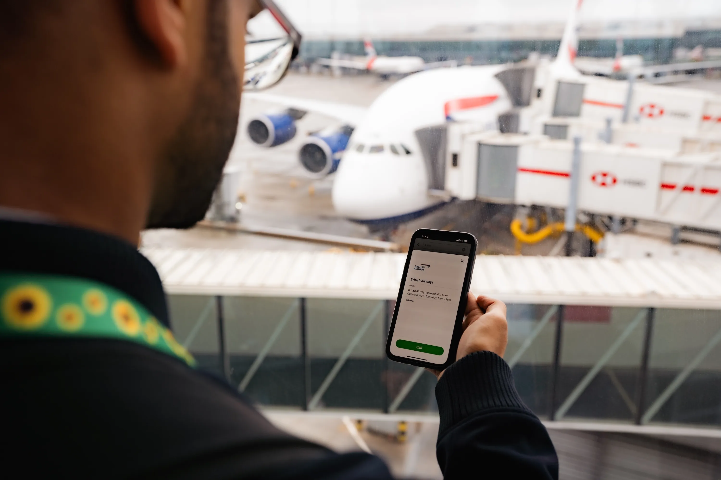
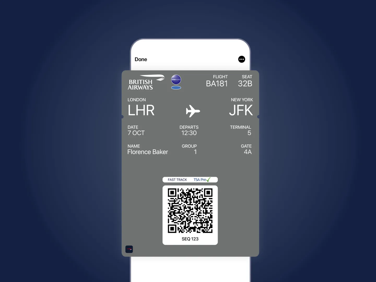
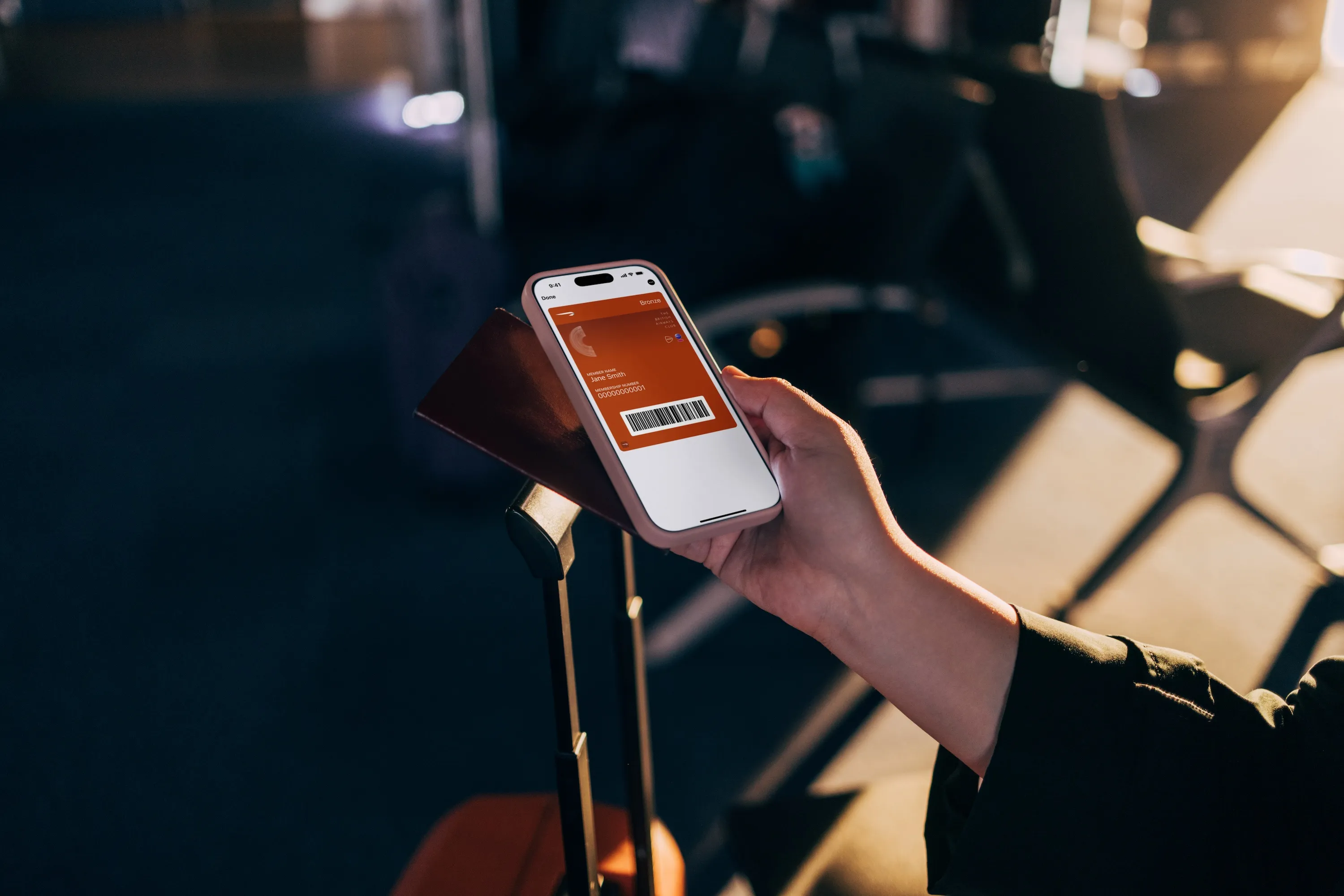
Several of these are now live and publicly visible: the notification centre surfaces as live activities and gate-change alerts in the 24 hours before departure, and the boarding pass saves straight to Apple or Google Wallet.
Each enhancement moved from proposal to engineering-ready feature through technical feasibility input and prioritisation, the unglamorous work that turns a design direction into a roadmap a squad can deliver.
Where it stands
The app’s most lasting outcome is the in-house team it justified.
The first release of the new app launched in June 2026, following an extended beta programme. The design foundations are live inside the programme, informing the vision, the component system and what ships next.
Demonstrating what a properly resourced in-house team could deliver helped make the case for a shift now underway: building a senior in-house design and research function that owns strategy and directs partners, contractors and tooling for execution, rather than depending on partners for the thinking. That team is now being recruited.
The first release is a beginning. The public roadmap already names what comes next, from reward-flight booking to real-time baggage tracking, and the companion model unfolds release by release as the platform’s capabilities come online. I am happy to walk through the work, the model and the road ahead in person.