Context
Like every subscription service, NOW’s hardest economics live in the first days of a membership.
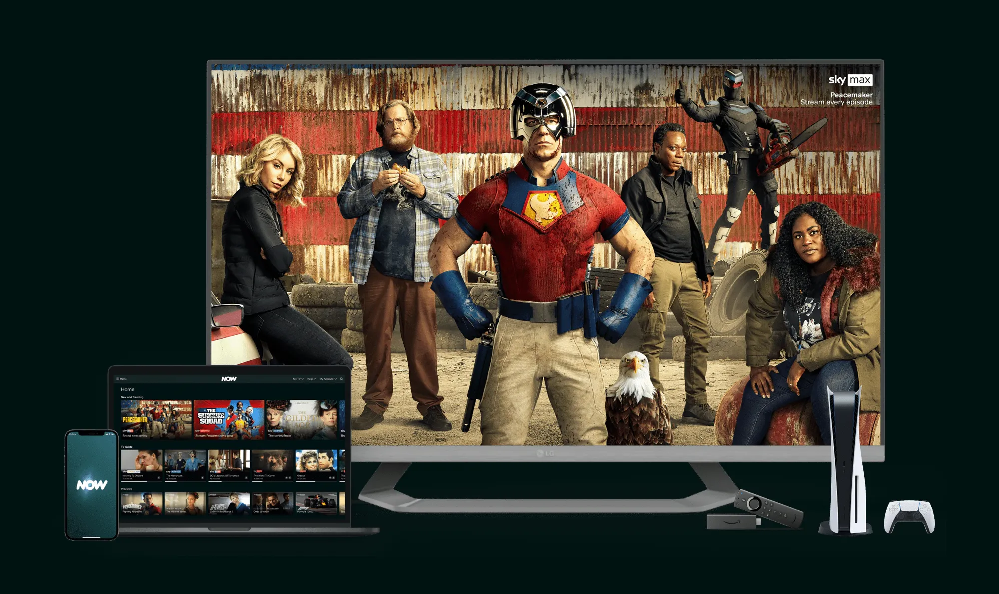
NOW is one of Europe’s biggest streaming platforms, available across mobile, tablet, web, consoles, smart TVs and set-top boxes. Early-life customers, those within their first three months and including returning subscribers, were around a quarter of the UK base but drove half of all cancellation attempts. Between 10 and 15% of cancellations happened on day zero, before a customer had really used the service at all.
The insight that anchored everything
Customers who watch at least two different things in their first week are meaningfully less likely to cancel.
That single finding anchored the whole effort, and retention keeps climbing as the number rises toward five. The corollary mattered just as much. Customers who watch the best library content are stickier than those who only chase the newest releases, and returning members stay longest when they find a mix of the familiar and the new. The pattern behind the churn was a plain one: many people subscribed for a single tentpole title, watched it, and left. “Show people more content” was the wrong problem. The real one: get the right second title in front of the right person, fast, on the device most likely to convert the habit.
Framing the problem as measurable
Discovery is only useful if the team can act on it.
So I tied the work to NOW’s product KPI hierarchy rather than to opinions. The primary metrics we believed we could move were total plays, frequency and repertoire; secondary signals included time to first play and visits without a play in the first seven days. From these I helped frame the OKRs the work should serve, including reducing the share of early-life customers who visit in their first week without ever pressing play, and lifting short-session visits where customers quickly find something worth watching. Naming the metrics up front gave every concept something concrete to answer to.
A catalogue built for testing
Discovery had to leave the squads a ranked, defensible backlog.
I ran ideation against a set of “how might we” questions, the sharpest being how to make the homepage feel personal on the very first load, and how to get more customers streaming on their TV on day zero, the device that converts the habit best. From those questions I generated, wireframed, prototyped and tested a corpus of concepts with customers, then RICE-scored them. The catalogue that resulted ran to 54 features and interactions, the concrete output of the discovery and the thing the squads actually built from.
That testing earned its keep by killing the idea I would have bet on. With almost no behavioural data on a first login, the tempting shortcut was to proxy personalisation from what we could infer: age, location, the cohort a customer belonged to. Recommendations built on who customers resemble… and they rejected it flatly. One person in their sixties told us they had a young spirit and no interest in what others their age were watching. Others did not want to be shown what their neighbours, or their city, were watching at all. Being told you are like the people around you turned out to be the opposite of personal.
So personalisation went content-led rather than identity-led, and the proximity concepts came off the board. Holding the catalogue loosely, with no favourite to defend, made it easier to let the evidence retire the concept that looked most attractive on paper and keep the ones customers actually responded to.
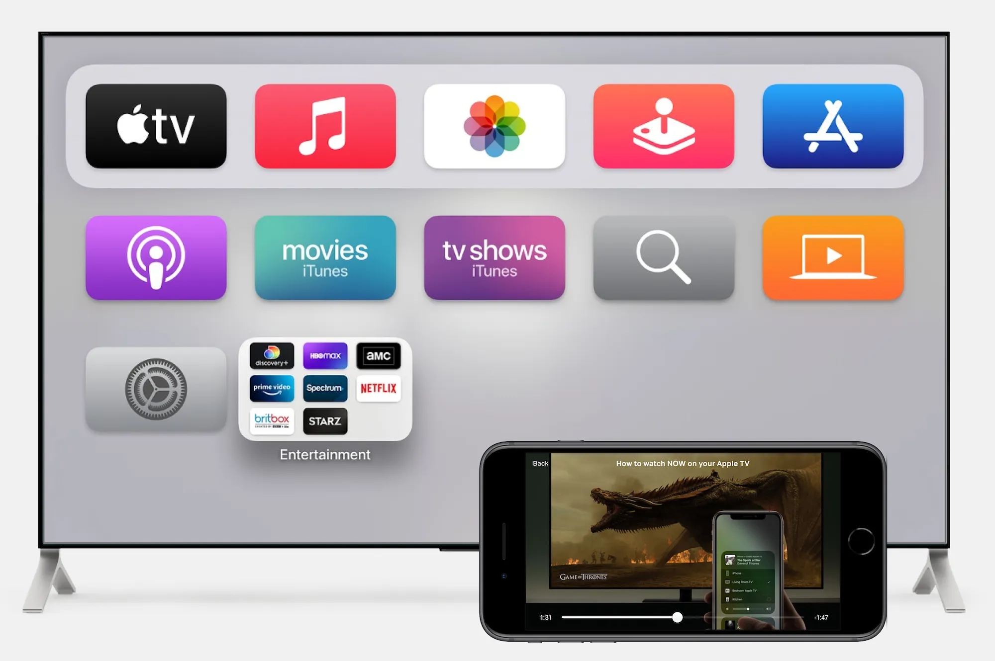
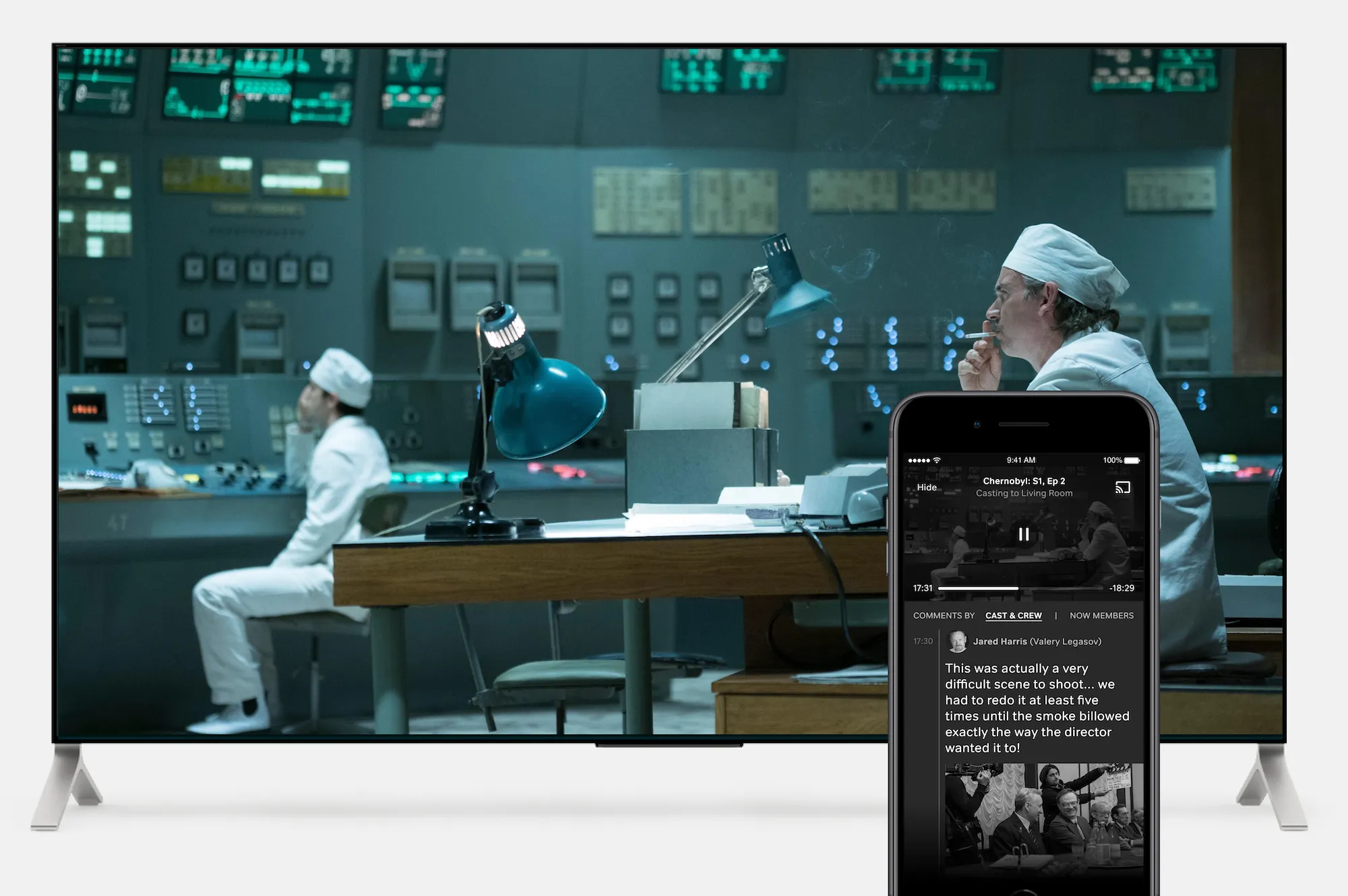
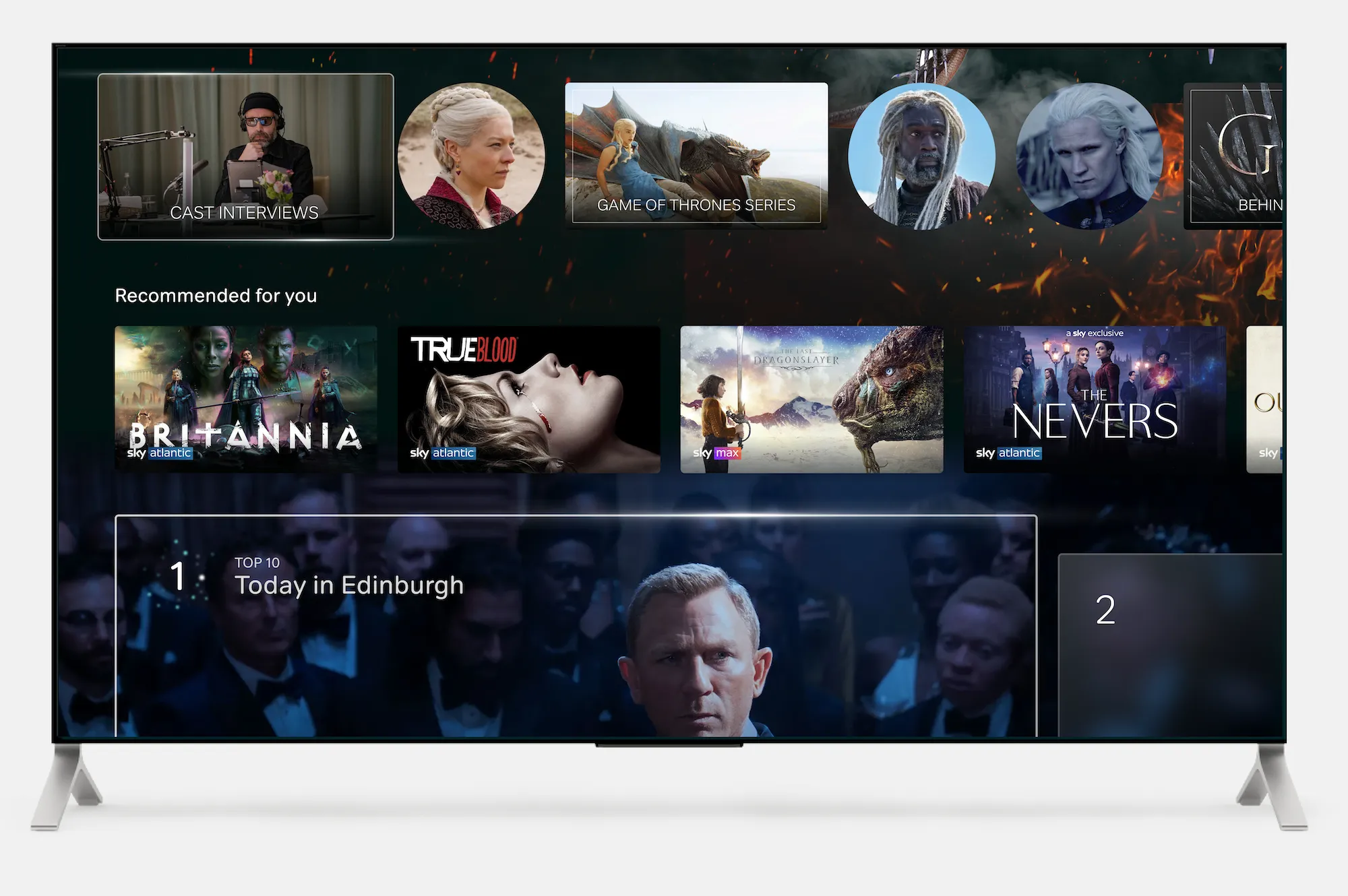
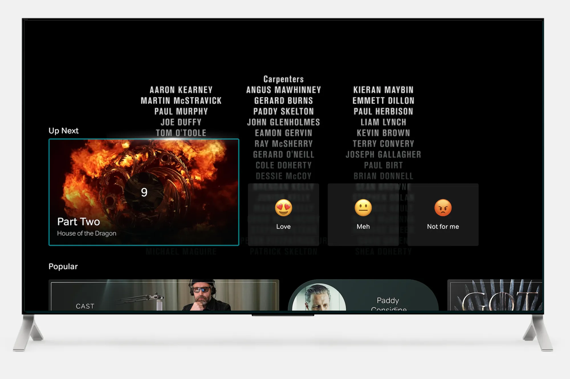
Feature mockup
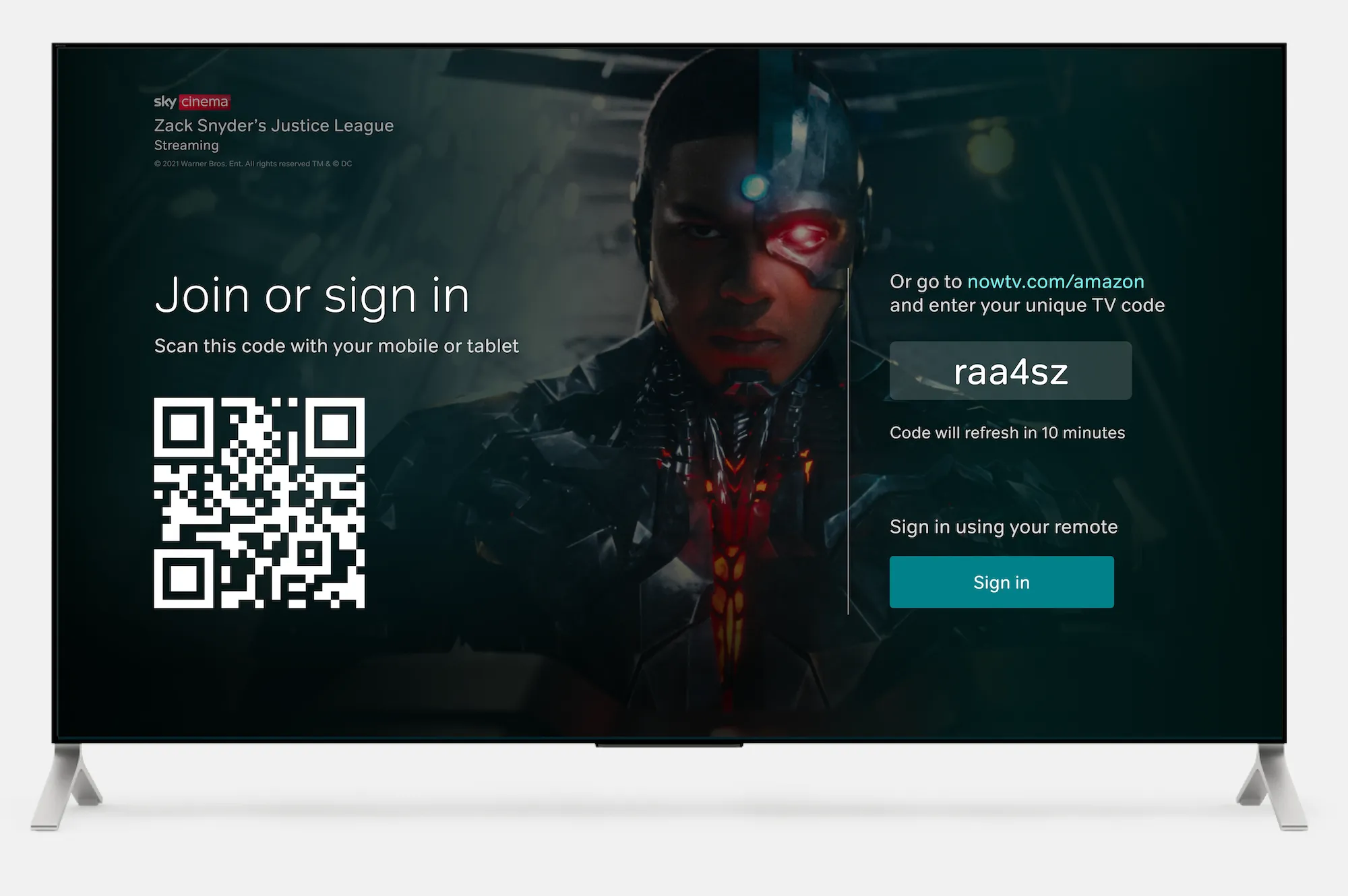
Keyboardless sign-in via QR Code, URL, or local network scan
Feature mockup
Onboarding instructions for big-screen usage through local network scan
Feature mockup
Mobile serving additional content, such as cast & crew comments, in sync with the big screen
Feature mockup
Demographics/location-based trending content rails
Feature mockup
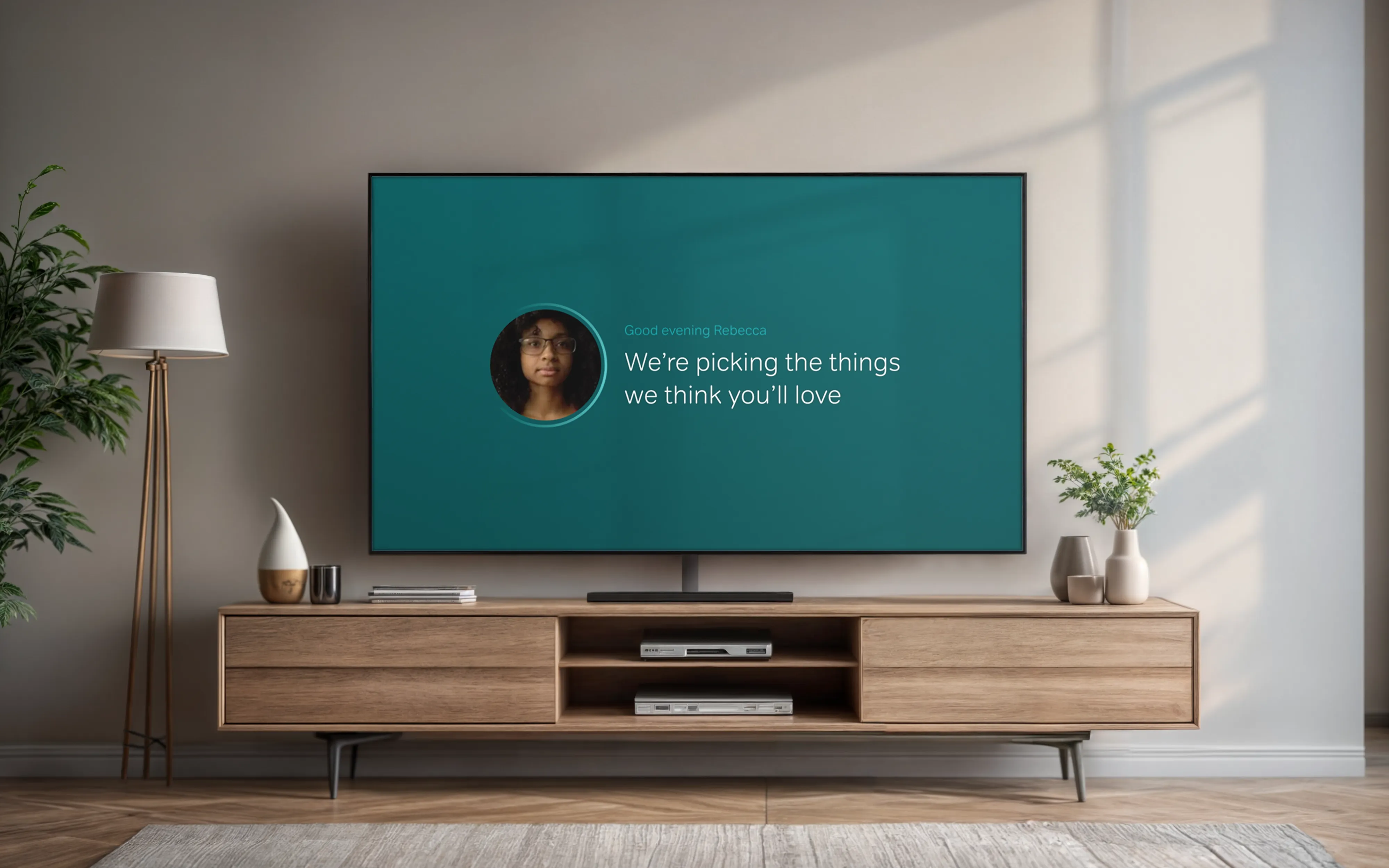
Continuous preference capturing throughout customer lifecycle
Feature mockup
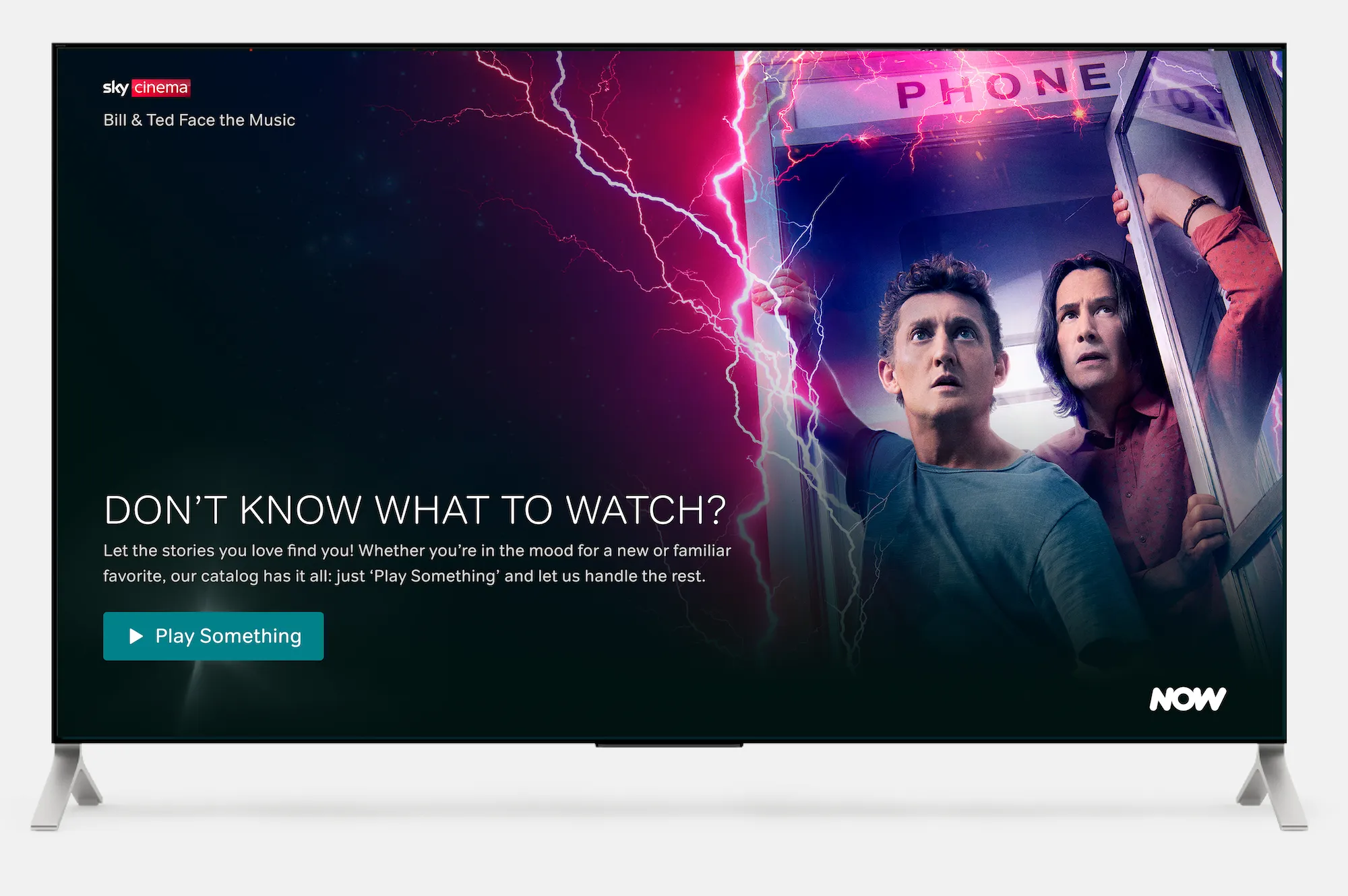
Shuffle content playout based on personal recommendations
Feature mockup
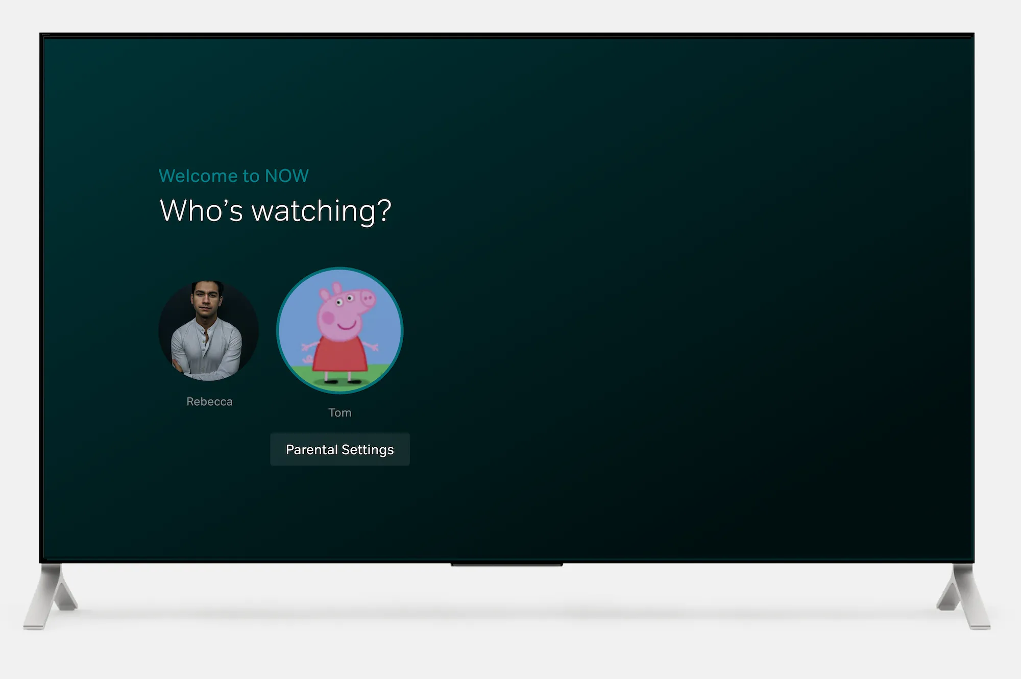
Split household profiles serving age-restricted content accordingly
Feature mockup
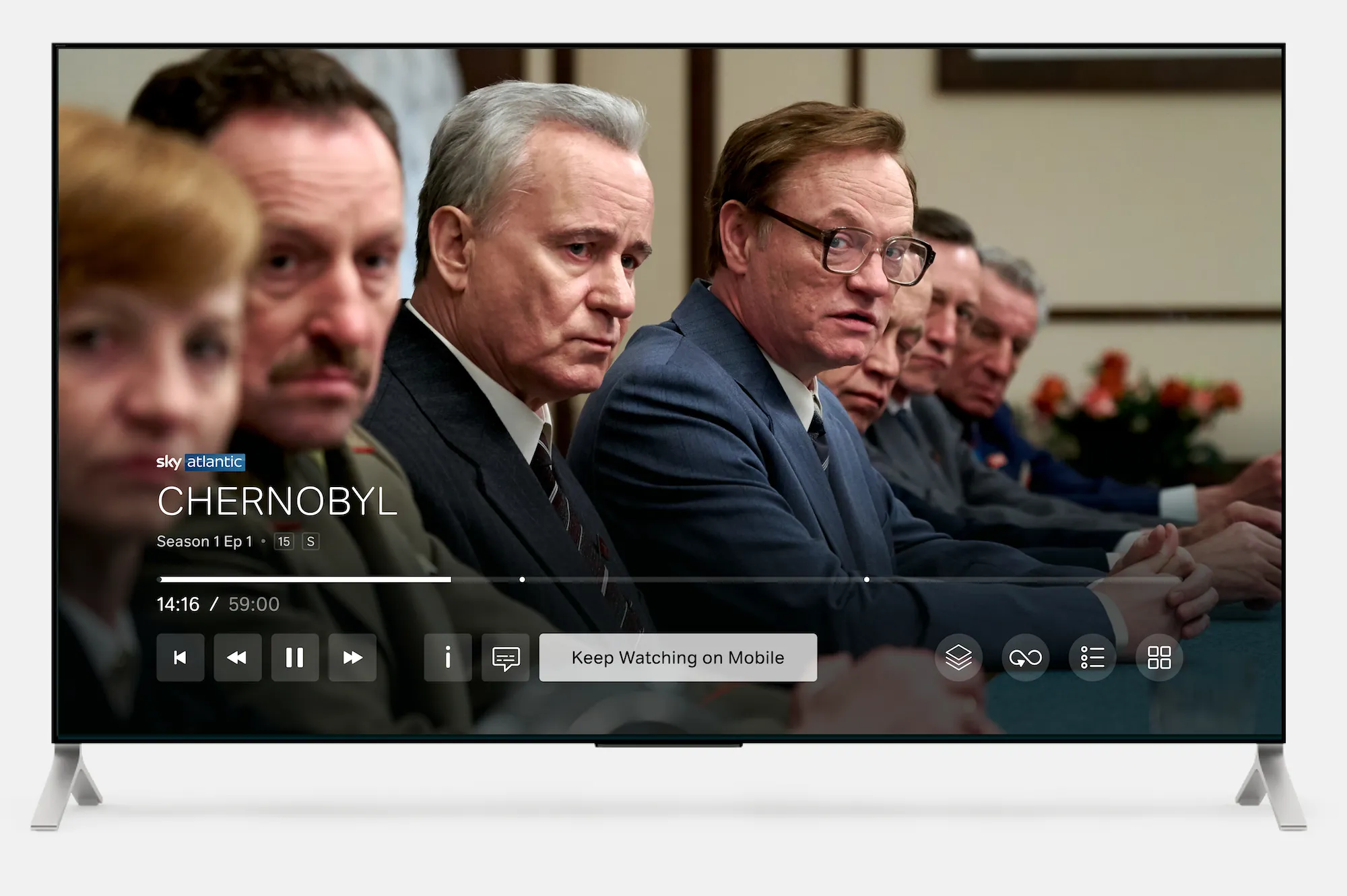
Optimised mobile handover to continue watching big-screen content on the go
What the catalogue prioritised
Each surviving concept was tested, scored and ranked.
The lead recommendations:
- Keyboardless TV sign-in, added across all big-screen devices and built into the sign-up and free-trial confirmation journeys, to remove the friction that keeps new customers off the device most likely to retain them
- A membership-aware first homepage, weighted toward the best library content a customer is actually entitled to rather than just the newest releases, and segmented for early-life customers
- Onboarding preference capture, asking light questions at sign-up to pre-populate a homepage that has almost no behavioural data to work with yet
- Connecting watched-content taste profiles to the marketing tools, so the first-week story stays consistent inside and outside the app
Keyboardless TV sign-in came out on top, and it did so without a contest. It was the most direct route into the behaviour the whole case was built on, getting customers watching on the big screen, where they were most likely to reach that second and third title. It also scored cleanly on RICE: high reach, low effort, and no dependency on data the platform did not yet have. The evidence made it an easy yes rather than a call anyone had to win.
Outcome
Discovery’s job is to de-risk what comes next.
This gave multiple NOW squads a shared, customer-grounded retention roadmap: a validated problem framing, the KPIs and OKRs to judge success against, and a ranked catalogue of 54 validated concepts, with keyboardless TV sign-in and homepage segmentation championed as immediate next steps. I was the only designer on the discovery. What lasted was a way of reasoning about early life that the teams kept using after the initiative closed.